It’s Not What it Seems – Competition 27th March 2025
Abstract art usually refers to the creation of non-representational or non-objective artworks that focus on colours, shapes, lines and textures, rather than visible objects or scenes. Use filters, blends, warp, overlays or light to create images in Photoshop (or similar).
The Judge for this competition was Geoff Smith. Geoff started his photography journey as an apprentice photo technician for SA Government in the early 70s. He went on to become a Senior Photographer. He later became a professional portrait photographer.
Geoff made some suggestions that all photographers could take note of. Several of the images with dark backgrounds had a one pixel wide border that made the image stand out when projected onto a screen as it differentiated the image from the dark background on the screen.
Geoff also said that when presenting a monochrome image the main subjects should have good tonal separation so that they don’t blend together.
The following are the top images from the competition and a brief summary of the Judge’s comments.
Projected Colour Set Subject
Topping the charts was Vicki Kramer with ‘Nub’ and Gial Iskov with ‘Water Colour’
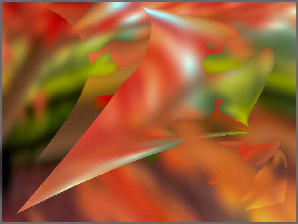
Of ‘Nub’ Geoff said it is a delightful change, the texture could be paint on the wall and it looks as though it has been printed on a lovely grade of art paper. Great subtlety of colour. A good use of the frame.

‘Water Colour’ is a very interesting study. The highlights were interesting, good forms and repetition of elements. It is fluid, the highlights are interesting. It has a very good structure and good design elements with the flow of the design going from bottom left to top right. Nicely composed.

Also scoring highly was Susan Bell with ‘Out of Place’. The image compositionally invites the viewer to explore the area that is not as busy, and leads the eye to left of centre. Good colour.

‘Amazing Technicolors’ by Kerry Malec has colours that jump out, compositionally it works beautifully. The attention is drawn down to the shape and the viewer is invited to explore up by the red colours and to see the blue line at the top.
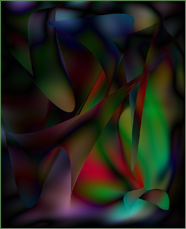
Gail Iskov’s ‘Autumn Leaves’ shows definition, there is good light, tone and texture. Good use of frame and shape. There is a 3D aspect to the image. It works very nicely.
Projected Monochrome Set Subject
The top scorer in this section was Judy Sara with ‘Daisy Mandala’.
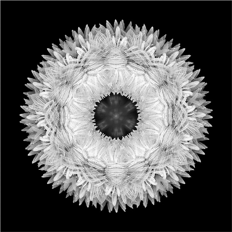
‘Mandala’ fits well within the square format. It is an interesting subject giving a suggestion of texture.
Projected Colour Open Category
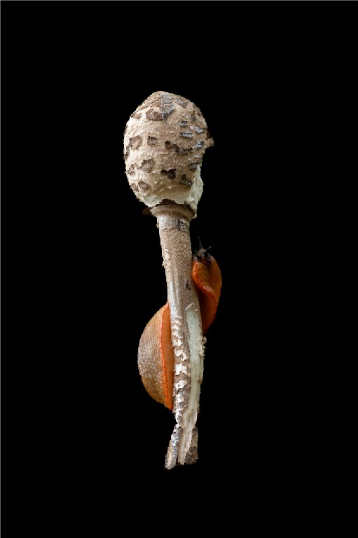
‘Gastro Slug’ by Meredith Retallack is a very impactful shot. The image is very tasteful. The slug is a lovely contrast colour.,
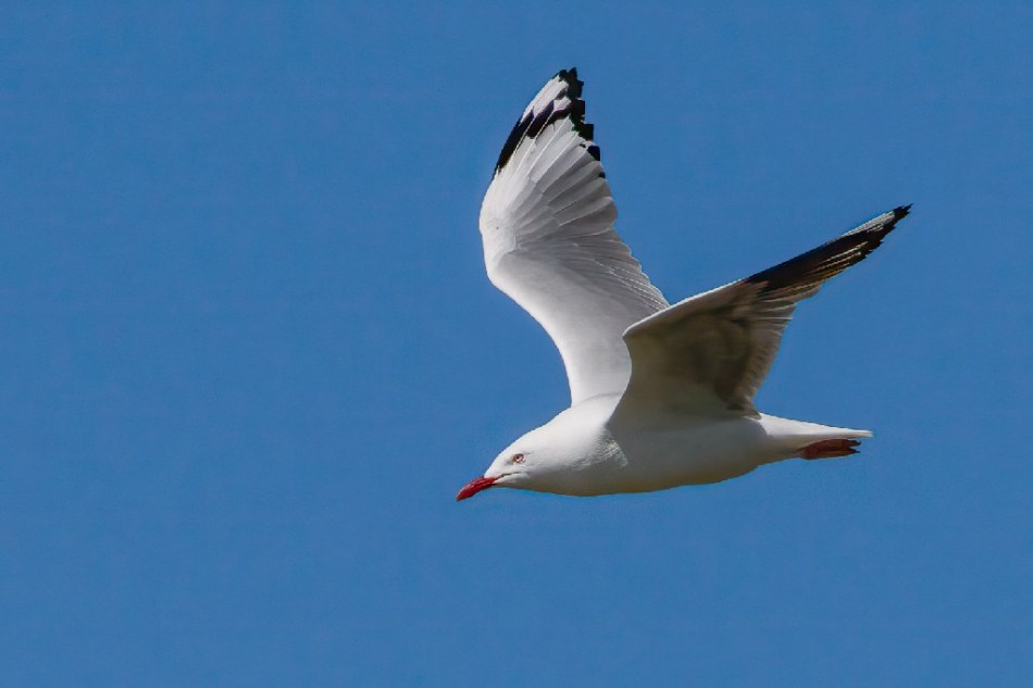
Gordon Lindqvist’s ‘Gull in Flight’ is a lovely capture, there is nothing distracting in the background. It is all about the light contrast against the blue sky. The red around the eye and on the beak stand out. There is space in front of the bird for it to move into.
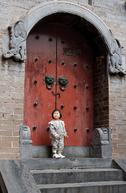
‘Knock Knock’ by Michael Selge is a delightful study with beautiful red doors and gargoyle knockers. It is a good use of frame.
Projected Monochrome Open Category
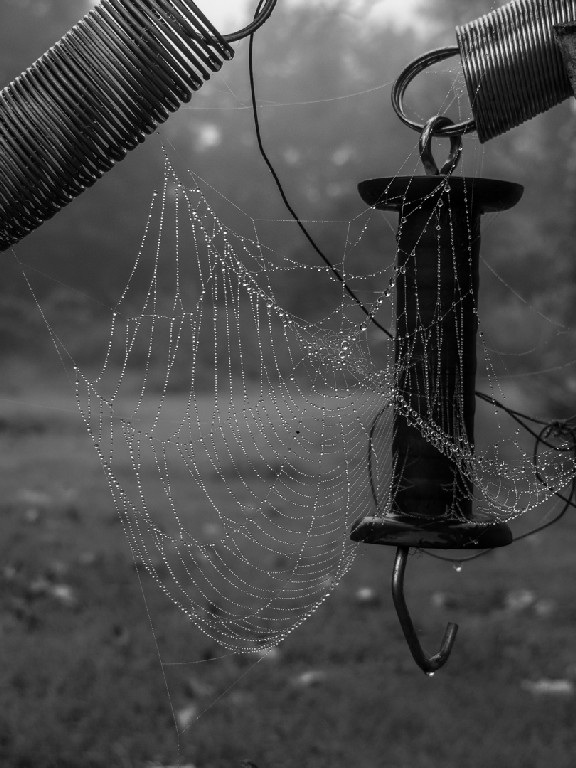
‘Adorned with Dew Drops’ by Meredith Retallack is a nice study with the backlight coming through on the dew drops and a diffused background. The lighting on the coils and springs works well and it has subdued colour and tones behind. The web is highlighted by the dew and it has strong contrast tonally.
Judy Sara’s ‘Sheep’ is interesting, even the sheep look interested. The image has good composition and it is good that the sheep are backlit. The separation of the individual animals is very good and the slow rise to the background frames the sheep well.

Colour Prints – Set Category
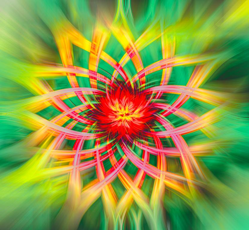
The square format of Judy Sara’s ‘Daisy Twirl’ frames the subject well. The strong colours stand out with the attractive brilliant red in the middle. It has nice symmetry.
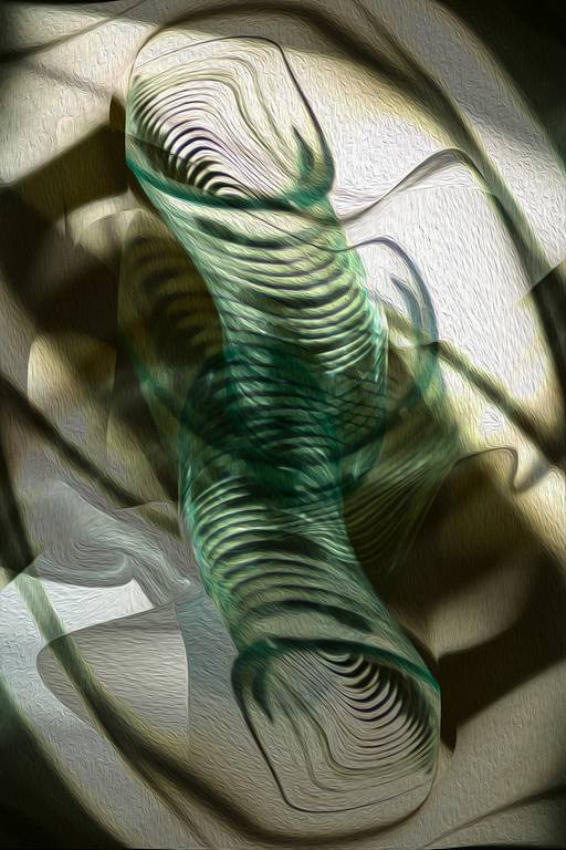
Vicki Kramer’s ‘Abstract Glass’ is an interesting composition, with different moulded shapes and the relevant shadows. The image has movement and has a strong diagonal composition. It shows a good use of the portrait format.
Lovely forms in Vicki Kramer’s ‘Lake Tahoe Morphed’ and it fits the space well. It keeps you guessing what it is.

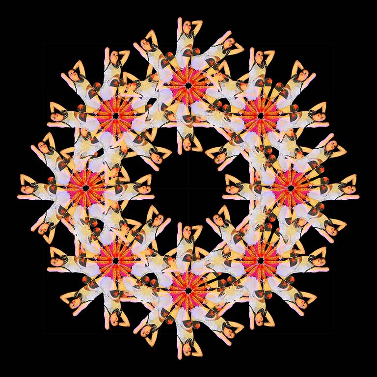
This is a high impact image by Vicki Kramer. ‘Which Way is Up’ fits into the square format well.
Colour Prints – Open Category
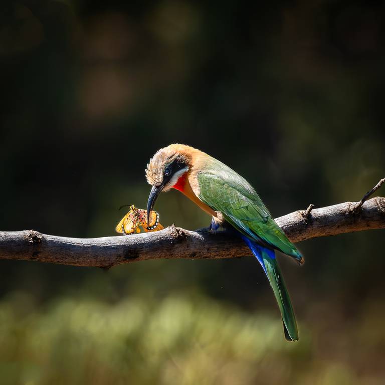
Judy Sara’s ‘Bee Eater Eating’ is a good use of the format, is has a horizontal element with the branch balanced by the line of the bird. Good detail on the bird and well executed and composed.
Again by Judy Sara, ‘Ostrich Family’ has warm tonings, the ostriches have good detail, good depth with the out of focus background. The three chicks tell a story. It is nicely composed with no distractions and enough space to give balance.

Michael Selge’s ‘Calistemon Snack’ shows the lovely colours of the bird and the flower. The background is controlled and out of the way. There are no distractions. The profile of the bird is good, rather than front on. It is looking at nebulous space.

Monochrome Prints – Open Category
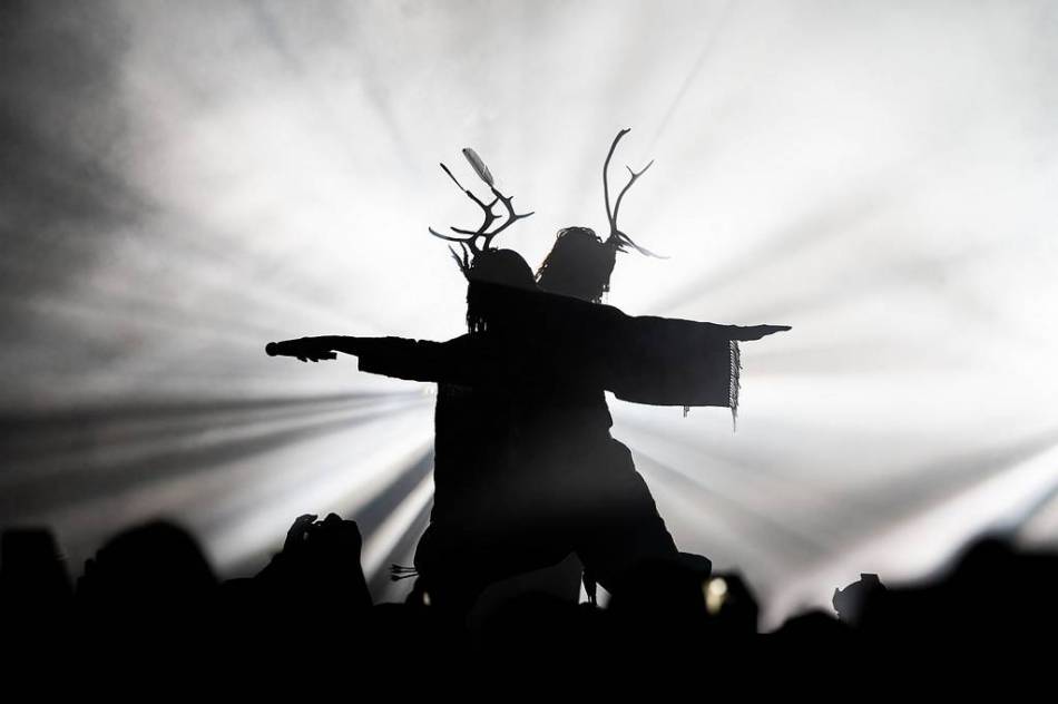
Michael Selge’s ‘Horny’ is all about the silhouette and the stark lighting. The movement from the arms and bodies add interest as does the diffused lighting.
Also by Michael Selge, ‘Dune Rats’ is a delightful live concert image. The singer’s eyes really stand out. There is strong lighting behind him, making this a difficult capture. The strength of the image is in the singers’ expression. The image has good tone and good composition.

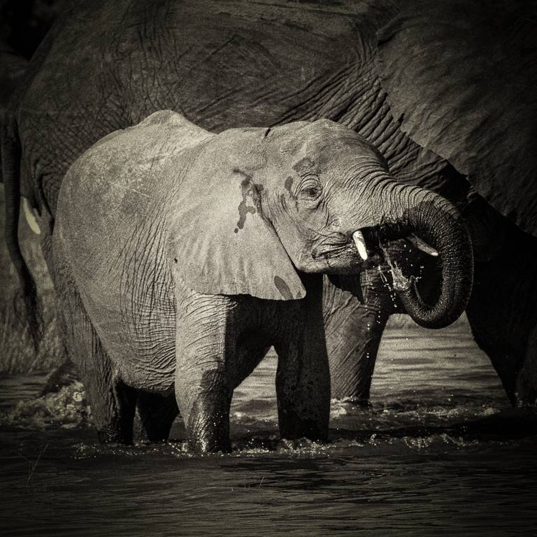
‘Baby Elephant Drinking’ by Judy Sara has good tonal separation. The little elephant shows good separation from the adult. The image has good texture. Even though we canno see the absolute scale of the larger beast, we can see the little one which gives the scale of the larger animal. There is enough detail on the highlights and it has a lovely tonal range and tells a story.
