
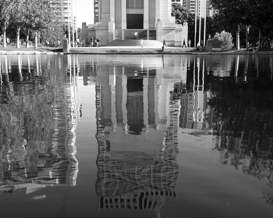
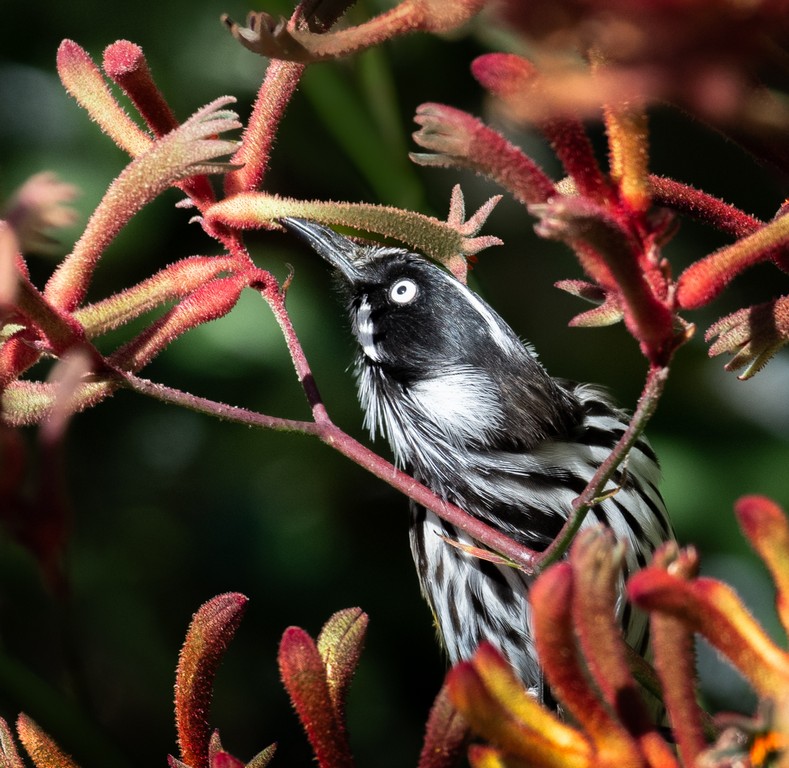
Silhouette – Competition 9th October 2025
An image using backlighting to present the main subject as a black shape against a much brighter background.
The following are the images that achieved the highest scores in the competition and the Judge’s comments.
In the projected colour set subject the top images were from Kerry Malec and Judy Sara.
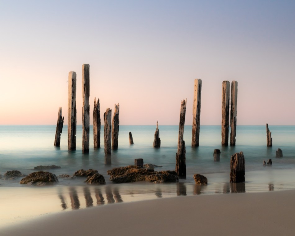
The Judge loved the simplicity of this image and pointed out that it was well composed technically, with the vertical item intersecting the foreground, the mid ground and the background, tieing the whole image together.
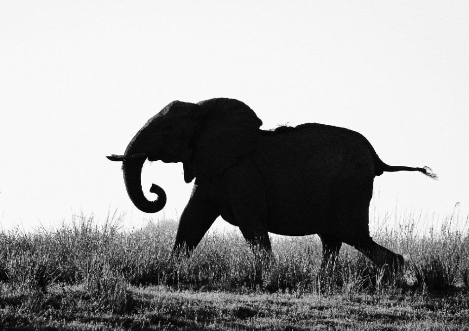
Judy Sara’s ‘Elephants on the Move’ is an example of a perfect silhouette with the elephant and calf in motion.

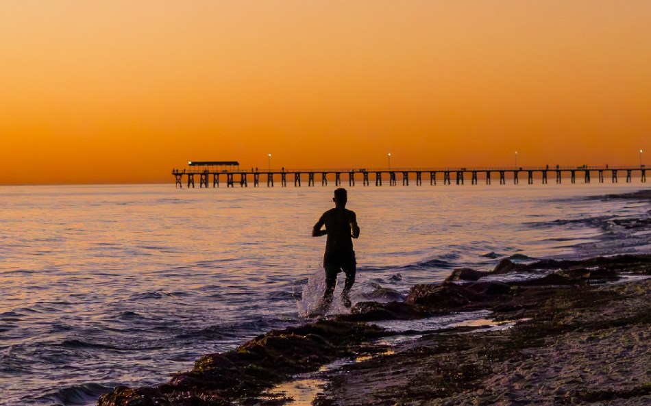
Also by Judy Sara, ‘Running Along the Beach’ has good composition with interest in the foreground, mid ground and sky.
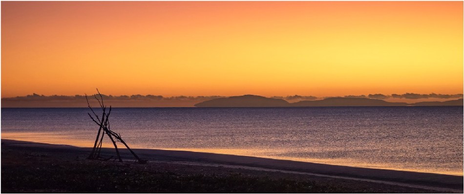
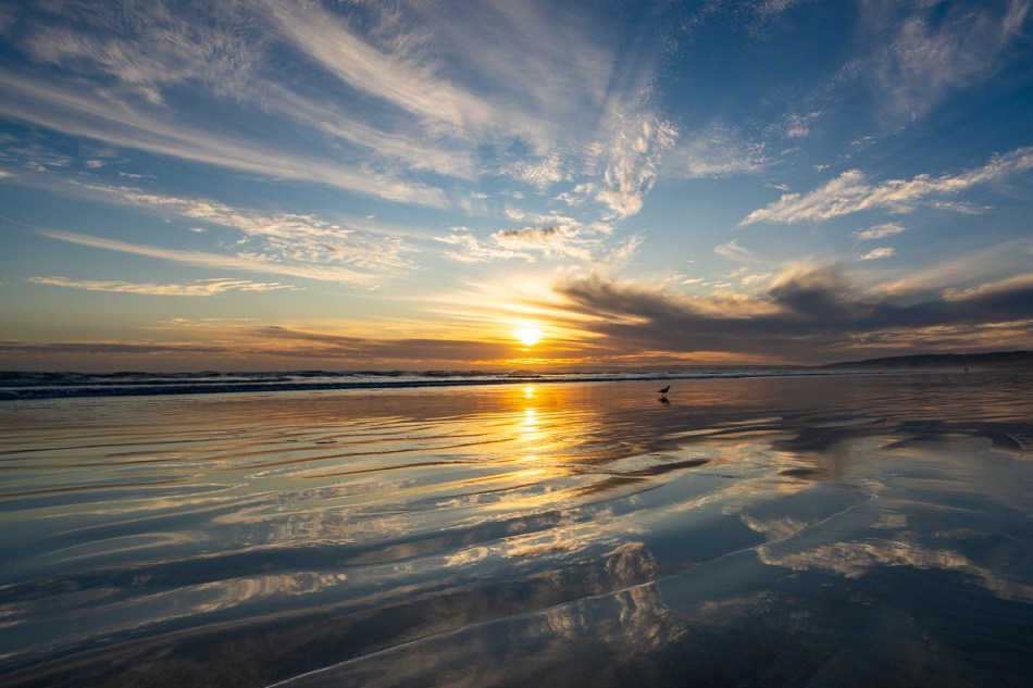
Meredith Retallack’s ‘Sunset Dreaming’ is also a good demonstration of a silhouette of the main subject with a beautiful sky. The lighting in the foreground makes the subject pop.

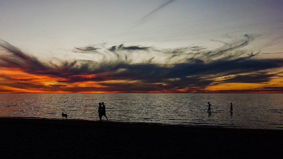
‘Sunset Dreaming’ by Vicki Kramer has captured the clouds as part of the silhouette and they pop against the bright sky. Plus it is a nice beach scene.
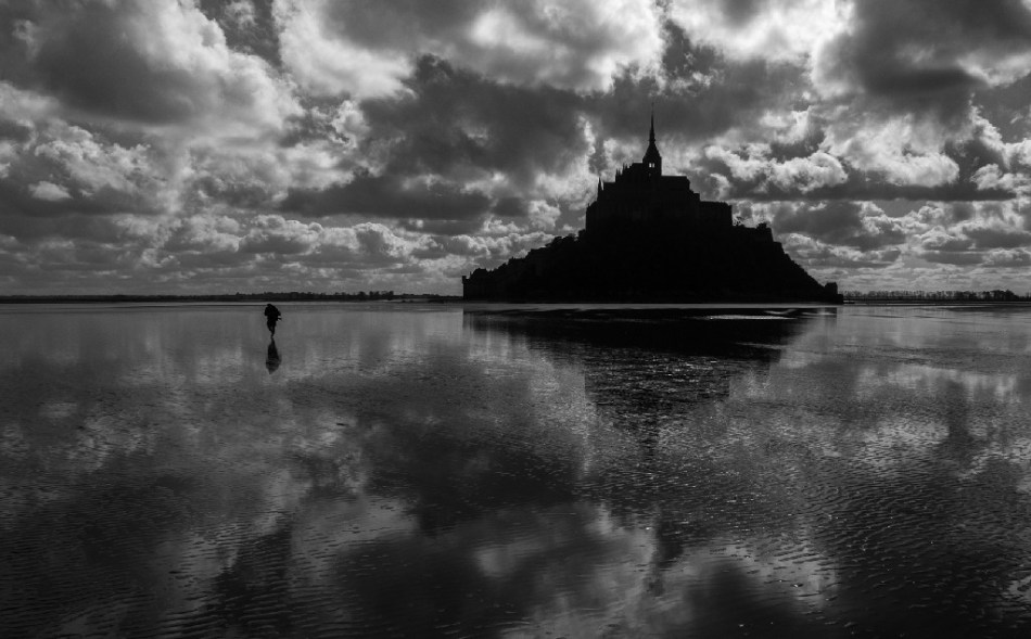
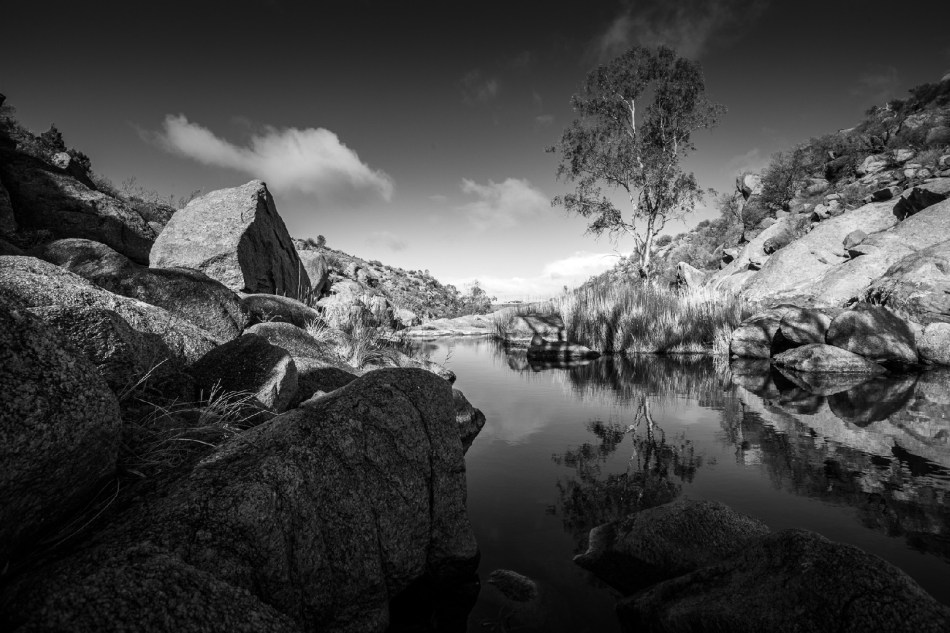
In the Silhouette set subject mono section Meredith Retallack’s ‘Leaving the Mount on Foot’ scored well. The image is defined well, the viewer can see the sunlight shining through the tower. The image has a fantastic sky and foreground interest with the reflection on the water, sand corrugations and the person giving mid ground interest.
In the open colour section, the top scorer was Sarah Bailey with “A Stroll in the Garden’. Sarah’s image was creative, and the contrast between the colours is very good.
In the open mono section Michael Selge’s ‘Victory’ is a great concert shot, the singer has been captured in an interesting pose and the lighting has been photographed well.

In the colour prints set subject category, Duart McLean scored the highest mark with ‘Palm Morning. This is a beautiful scene, with soft colouring and good gradation in the sky.

In the mono prints set subject category the highest scorer was Judy Sara for ‘Elephant on the run’. The Judge found this to be a fantastic image, the rim lighting shows the texture on the trunk and in the corrogations. The image is dynamic with action and movement.
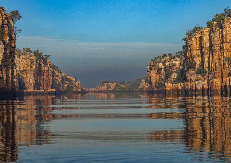
Following the set subject categories are the open categories. In the colour prints Duart McLean’s image impressed the judge the most with ‘River Reflections’. This is a beautiful image, the lighting shows it was taken at the right time of day, it shows the texture on the cliffs and has lovely contrasts. The lines lead the viewer into the background. The ripples add interest to the photo as does the sky.
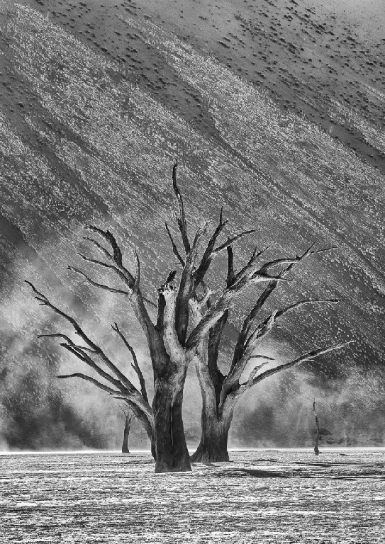
Lastly in the mono open category Judy Sara’s ‘Trees in the Storm’ is a superb image, with an interesting foreground and wonderful trees. Nice lighting shows the curve of the branches. It has a lovely background with the diagonal lines contrasting with the vertical lines on the ground.
It’s Not What it Seems – Competition 27th March 2025
Abstract art usually refers to the creation of non-representational or non-objective artworks that focus on colours, shapes, lines and textures, rather than visible objects or scenes. Use filters, blends, warp, overlays or light to create images in Photoshop (or similar).
The Judge for this competition was Geoff Smith. Geoff started his photography journey as an apprentice photo technician for SA Government in the early 70s. He went on to become a Senior Photographer. He later became a professional portrait photographer.
Geoff made some suggestions that all photographers could take note of. Several of the images with dark backgrounds had a one pixel wide border that made the image stand out when projected onto a screen as it differentiated the image from the dark background on the screen.
Geoff also said that when presenting a monochrome image the main subjects should have good tonal separation so that they don’t blend together.
The following are the top images from the competition and a brief summary of the Judge’s comments.
Projected Colour Set Subject
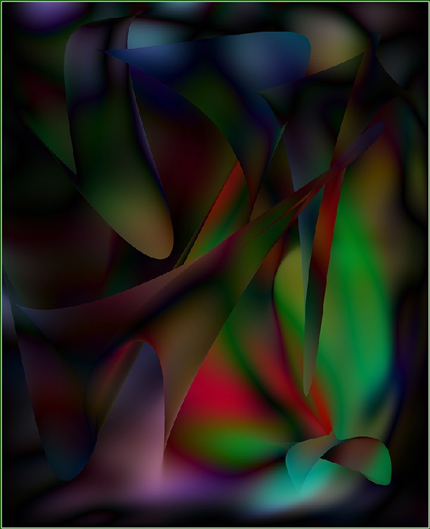
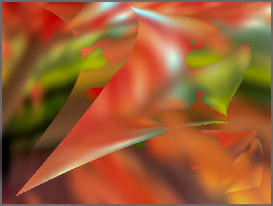
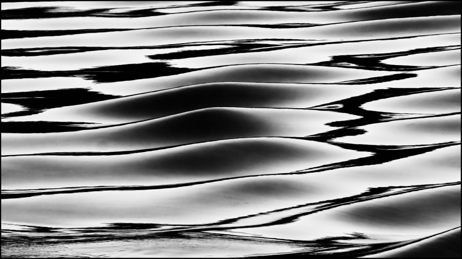
Topping the charts was Vicki Kramer with ‘Nub’ and Gial Iskov with ‘Water Colour’
Of ‘Nub’ Geoff said it is a delightful change, the texture could be paint on the wall and it looks as though it has been printed on a lovely grade of art paper. Great subtlety of colour. A good use of the frame.

‘Water Colour’ is a very interesting study. The highlights were interesting, good forms and repetition of elements. It is fluid, the highlights are interesting. It has a very good structure and good design elements with the flow of the design going from bottom left to top right. Nicely composed.

Also scoring highly was Susan Bell with ‘Out of Place’. The image compositionally invites the viewer to explore the area that is not as busy, and leads the eye to left of centre. Good colour.

‘Amazing Technicolors’ by Kerry Malec has colours that jump out, compositionally it works beautifully. The attention is drawn down to the shape and the viewer is invited to explore up by the red colours and to see the blue line at the top.
Gail Iskov’s ‘Autumn Leaves’ shows definition, there is good light, tone and texture. Good use of frame and shape. There is a 3D aspect to the image. It works very nicely.
Projected Monochrome Set Subject
The top scorer in this section was Judy Sara with ‘Daisy Mandala’.
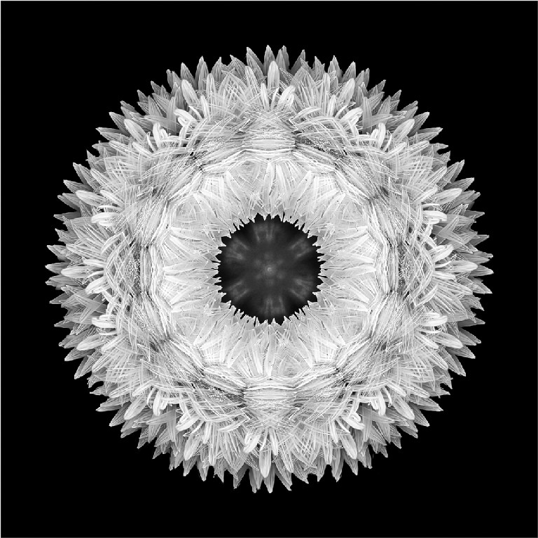
‘Mandala’ fits well within the square format. It is an interesting subject giving a suggestion of texture.
Projected Colour Open Category
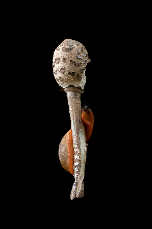
‘Gastro Slug’ by Meredith Retallack is a very impactful shot. The image is very tasteful. The slug is a lovely contrast colour.,
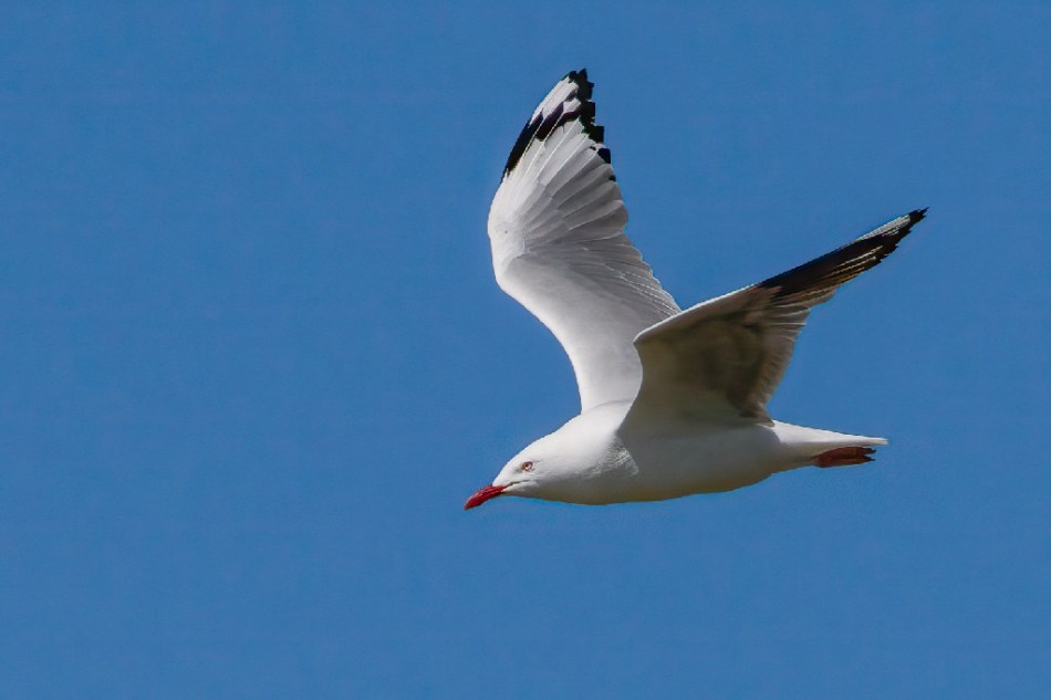
Gordon Lindqvist’s ‘Gull in Flight’ is a lovely capture, there is nothing distracting in the background. It is all about the light contrast against the blue sky. The red around the eye and on the beak stand out. There is space in front of the bird for it to move into.
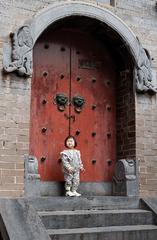
‘Knock Knock’ by Michael Selge is a delightful study with beautiful red doors and gargoyle knockers. It is a good use of frame.
Projected Monochrome Open Category
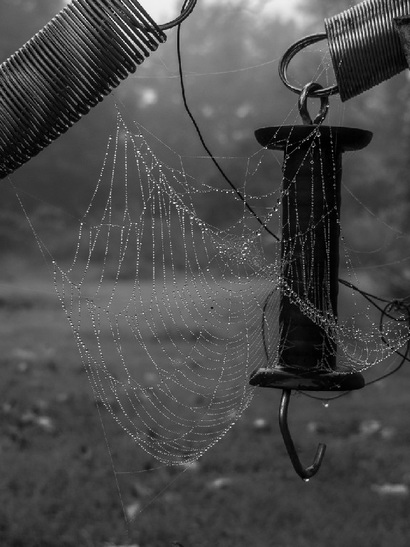
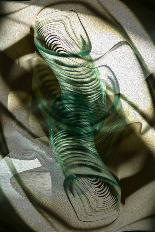
‘Adorned with Dew Drops’ by Meredith Retallack is a nice study with the backlight coming through on the dew drops and a diffused background. The lighting on the coils and springs works well and it has subdued colour and tones behind. The web is highlighted by the dew and it has strong contrast tonally.
Judy Sara’s ‘Sheep’ is interesting, even the sheep look interested. The image has good composition and it is good that the sheep are backlit. The separation of the individual animals is very good and the slow rise to the background frames the sheep well.

Colour Prints – Set Category
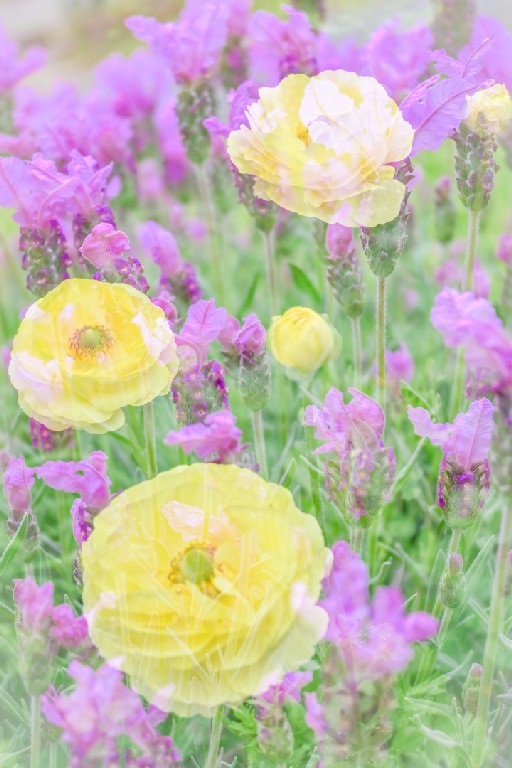
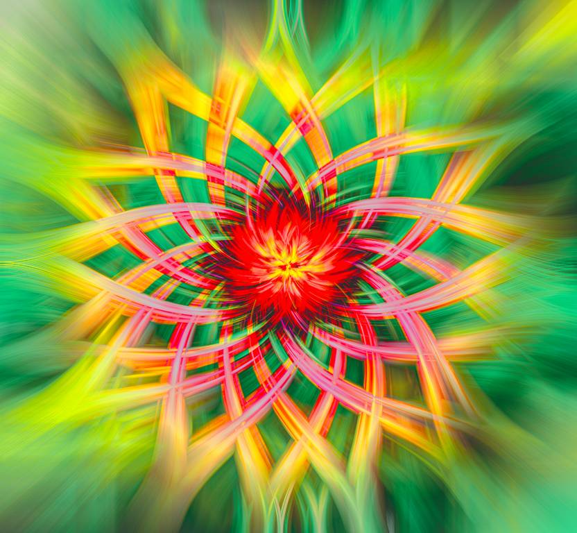
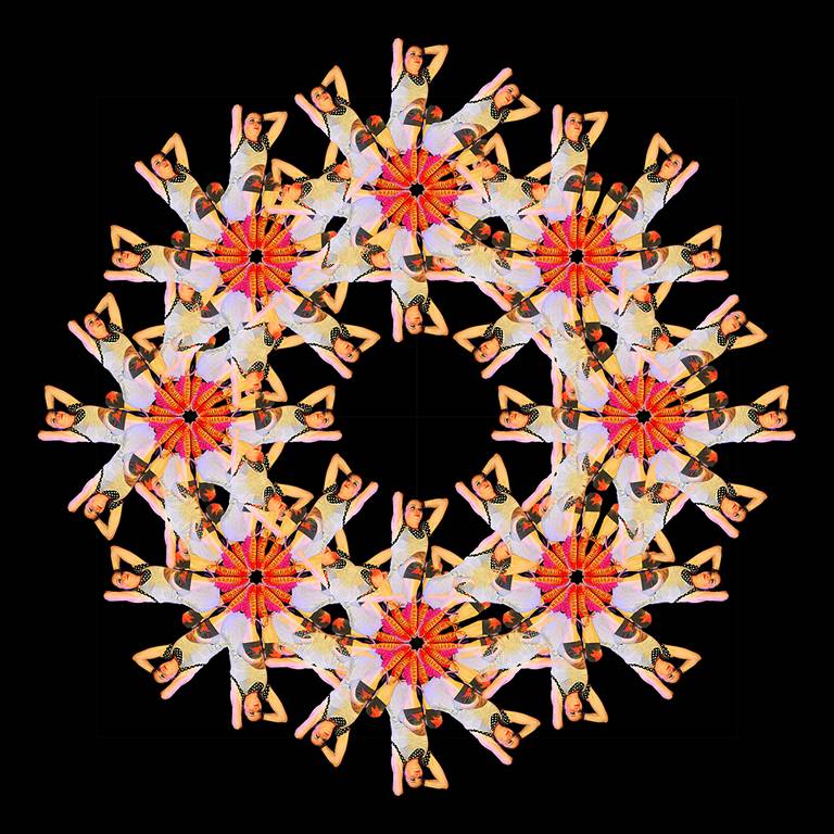
The square format of Judy Sara’s ‘Daisy Twirl’ frames the subject well. The strong colours stand out with the attractive brilliant red in the middle. It has nice symmetry.
Vicki Kramer’s ‘Abstract Glass’ is an interesting composition, with different moulded shapes and the relevant shadows. The image has movement and has a strong diagonal composition. It shows a good use of the portrait format.
Lovely forms in Vicki Kramer’s ‘Lake Tahoe Morphed’ and it fits the space well. It keeps you guessing what it is.

This is a high impact image by Vicki Kramer. ‘Which Way is Up’ fits into the square format well.
Colour Prints – Open Category
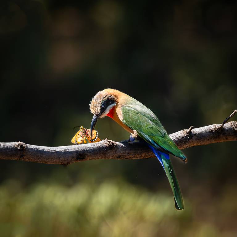
Judy Sara’s ‘Bee Eater Eating’ is a good use of the format, is has a horizontal element with the branch balanced by the line of the bird. Good detail on the bird and well executed and composed.
Again by Judy Sara, ‘Ostrich Family’ has warm tonings, the ostriches have good detail, good depth with the out of focus background. The three chicks tell a story. It is nicely composed with no distractions and enough space to give balance.

Michael Selge’s ‘Calistemon Snack’ shows the lovely colours of the bird and the flower. The background is controlled and out of the way. There are no distractions. The profile of the bird is good, rather than front on. It is looking at nebulous space.

Monochrome Prints – Open Category
Michael Selge’s ‘Horny’ is all about the silhouette and the stark lighting. The movement from the arms and bodies add interest as does the diffused lighting.
Also by Michael Selge, ‘Dune Rats’ is a delightful live concert image. The singer’s eyes really stand out. There is strong lighting behind him, making this a difficult capture. The strength of the image is in the singers’ expression. The image has good tone and good composition.

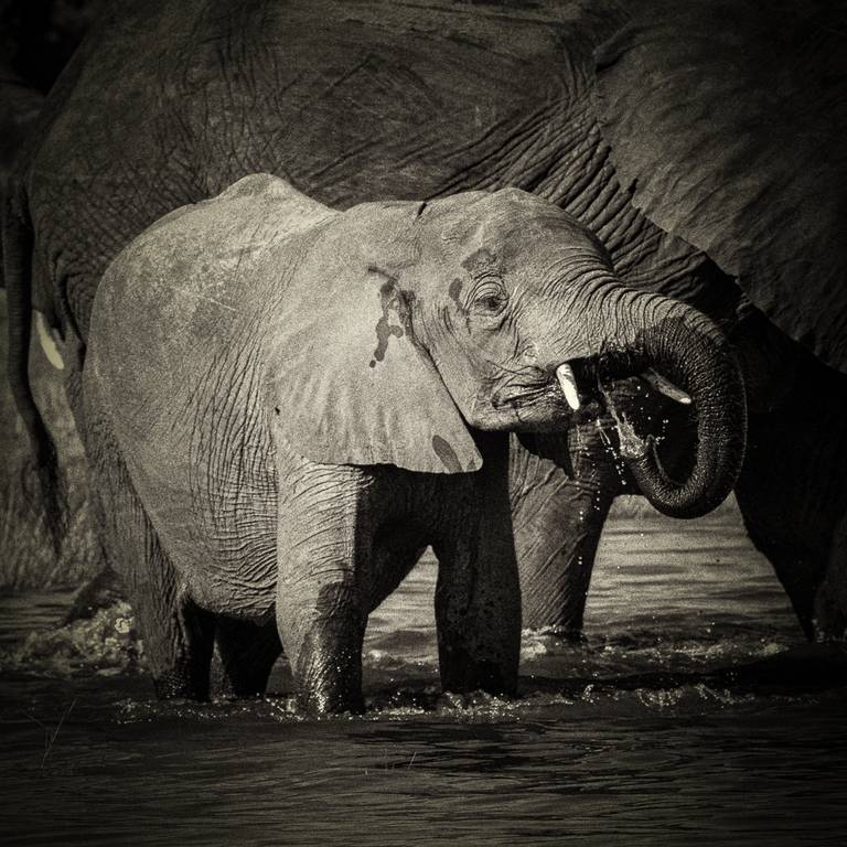
‘Baby Elephant Drinking’ by Judy Sara has good tonal separation. The little elephant shows good separation from the adult. The image has good texture. Even though we canno see the absolute scale of the larger beast, we can see the little one which gives the scale of the larger animal. There is enough detail on the highlights and it has a lovely tonal range and tells a story.
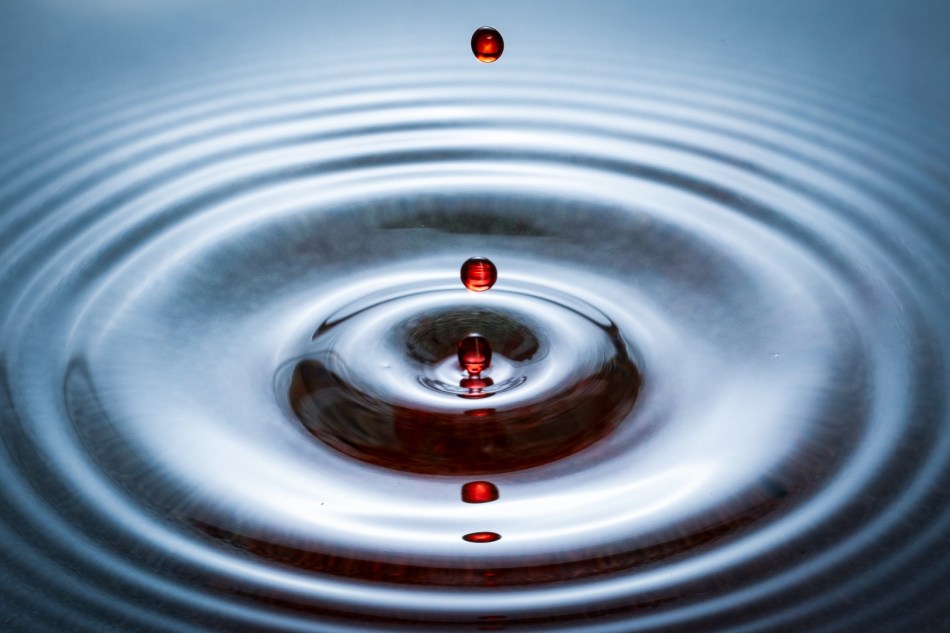
Water – Competition 13th February 2025
This competition requires the photographer to capture the way in which water moves and the way it interacts with light, in either a natural setting or a controlled environment.
The Judge for this competition was Peter Phillips. Peter is a member of the Edwardstown Photographic Club, and has been a judge for 20 years.
The following are the top images from the competition and the Judge’s comments.
Projected Colour Set Subject
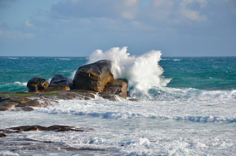
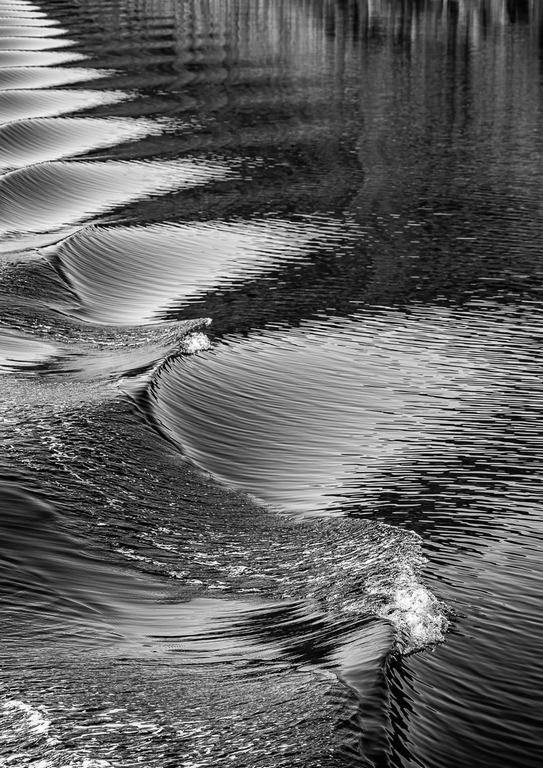
Hazel Marshall’s image ‘Wave Meets Rocks’ used a fast shutter speed capturing the action of the wave.
‘Reflective Water’ by Michael Selge caught the sunrise. The seagull draws the viewer’s attention and the image has nice colours. Michael got low to capture this shot.
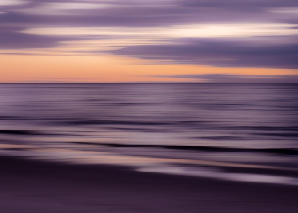
Sarah Bailey’s ‘Liquid Twilight’ was very nicely caught, with intentional camera movement giving a beautiful result.
‘Drip Drop’ also by Michael Selge was not an easy subject to capture, but was handled very well.
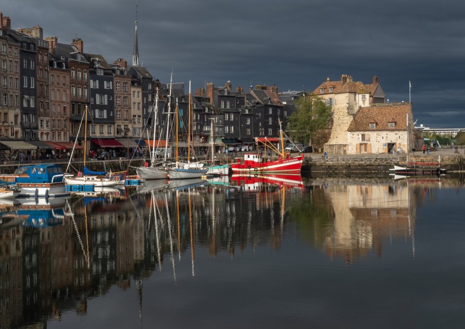
‘Old Port, Honfleur’ by Meredith Retallack has a nice reflection and good light, especially the light on the building. The colours pop.
‘Ripples’ was taken by Hazel Marshall. A simple composition that shows the ripples on the water well.
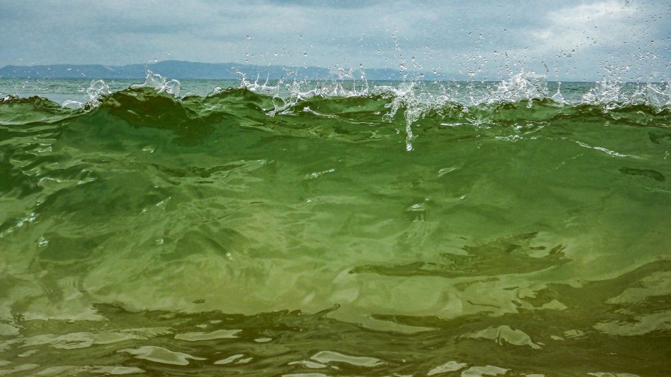
‘Wall of Water’ taken by Vicki Kramer has captured amazingly green water.
Sarah Bailey’s ‘Water’s Whispers’ has a beautiful soft look.
Projected Monochrome Set Subject
Judy Sara’s ‘Curves and Horizontals’ is well handled, the whites are not blown out and has good composition.
Meredith Retallack’s ‘Profusion of Pearls’ shows the light reflections very well with good composition.

The following two images were taken by Judy Sara. The first ‘Ripples in the Waves’ has nice composition. The ripples with the reflections and the pattern is what makes this photo.

The second, ‘Drinking’ shows an elephant from a different perspective.

Projected Colour Open Category
The Judge said ‘Love is in the Air’ by Sheila Gatehouse was well spotted, a quirky photo.

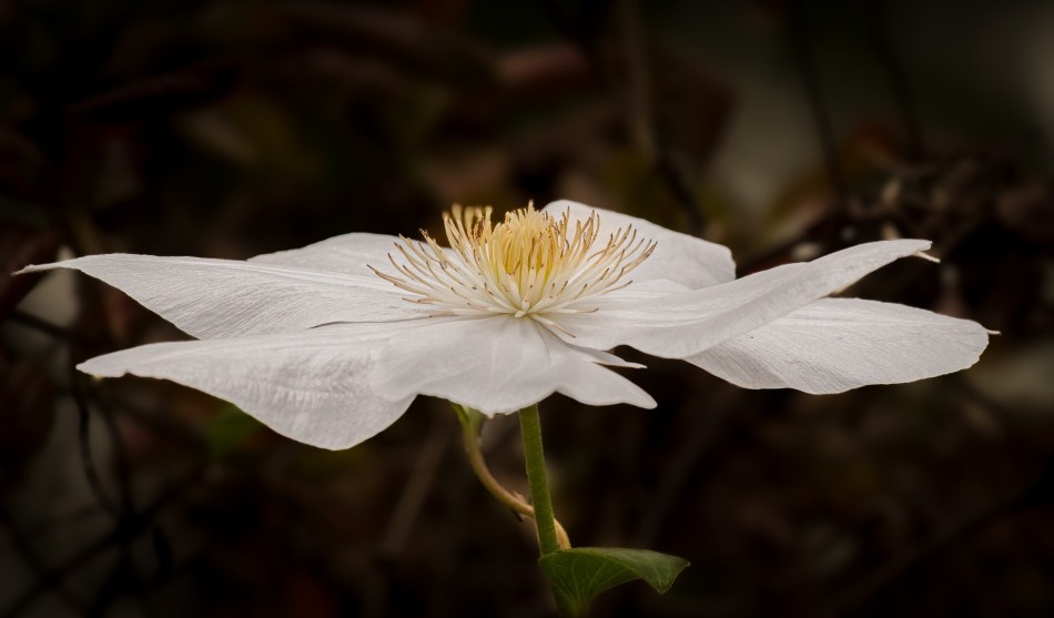
‘Clematis’ by Susan Bell has been nicely taken, with good depth of field, with a good out of focus background.
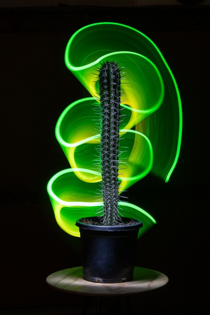
‘Illuminated Cactus’ by Gordon Lindquist is an interesting photo, creative and well thought through and taken.
‘Lumpy Bits’ is difficult to determine what the photo is of, but has an abstract feel, it keeps you guessing.
Projected Monochrome Open Category
‘Meredith Retallack’s ‘Arches, Toulouse’ has a good aspect to the arches with people walking through at exactly the right moment.
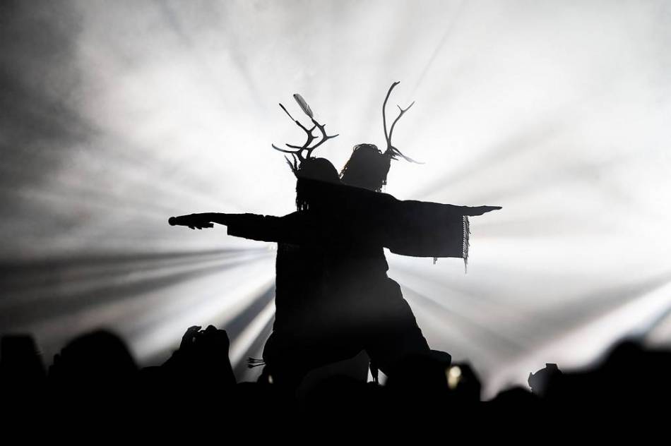
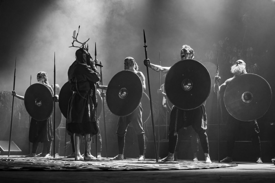
‘Heilung’ by Michael Selge has difficult lighting for photography, the man with his arm out and open mouth steals the show. It is a powerful shot.
Heather Connolly’s ‘Inneston Weeds’ is a very simple, with good composition and good detail. The plants stand out and are nicely isolated.
‘Hammerfall’ by Michael Selge is a good stage shot.

Rod Patterson’s ‘Mannum Falls’ is nicely exposed. Good black and white tones.
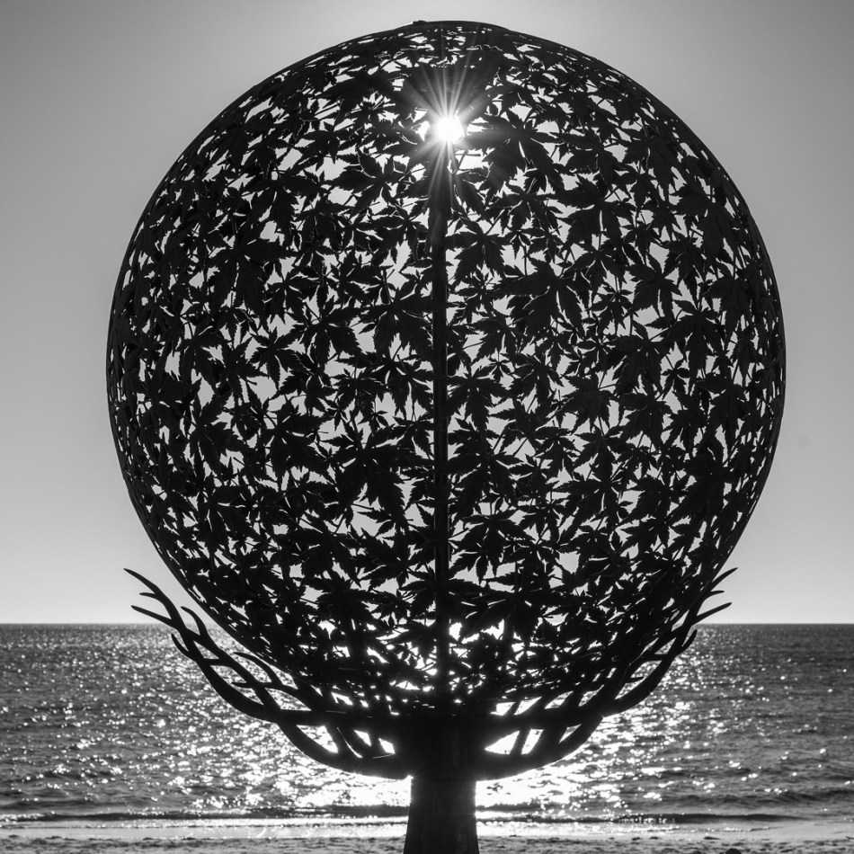
Michael Selge’s ‘Sphere’ shows a lovely piece of sculpture.
Prints Colour Set Category
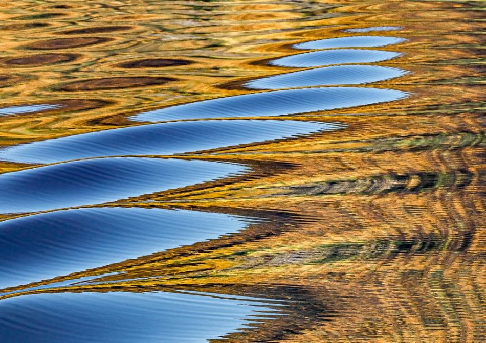
‘Autumn Reflections’ by Judy Sara used gold and blue which are great complementary colours. The image has a wow factor with the reflections showing the subtle movement of water.
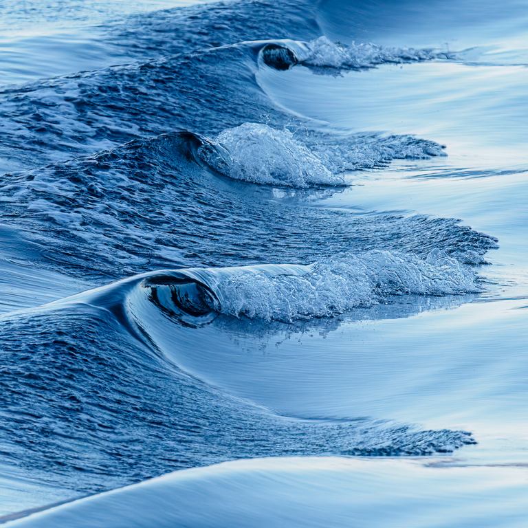
Also by Judy Sara ‘Bow Waves’ shows the light on the crest of the waves.
Mono Prints Set Category
‘Into the Deep’ by Vicki Kramer shows the movement of water, you can see the air bubbles. It is a creative shot.
Judy Sara’s ‘Waves and Reflections’ is a nice shot.
Colour Prints Open Category
Michael Selge’s ‘Calistemon Snack’ is beautifully sharp with great feather detail. The bottle brush is sharp and the photo is well composed.
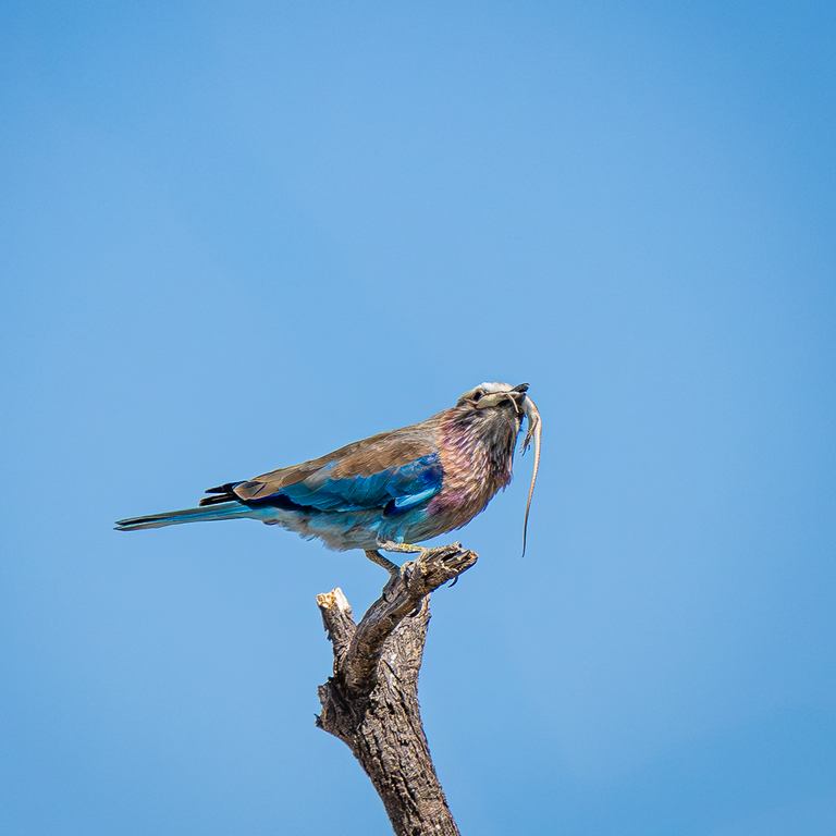
Judy Sara’s ‘Lilac Breasted Roller with Lizard has been presented in a minimalistic manner.
Mono Prints Open Category
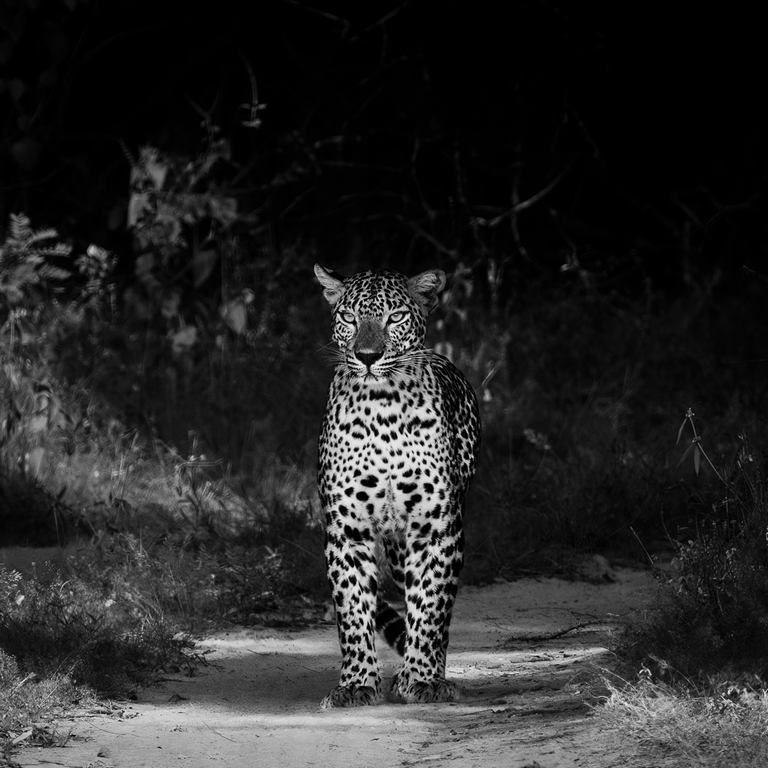
Judy Sara’s ‘Coming Down the Path’ is lovely and sharp, the dark background isolates the animal beautifully. Well presented.
‘Dune Rat’ by Michael Selge has been excellently handled, especially with the difficult lighting. Lovely light on the face, with his wide open eyes. The drums in the background don’t intrude.
Vicki Kramer’s Memorial Reflections’ creates impact where the photo is brightest, the ripple effect shows the reflection well.
Fill the Frame – Competition 20th June 2024
The Judge of the “Fill the Frame” competition was Keith Seidel. Keith has been a photographer for more than 50 years. He began shooting on his 13th birthday when he was given a Pentax Spotmatic camera. He is a Judging Coordinator with South Australian Photographic Federation and conducts Light on the Light workshops. He likes to spend time in the Flinders and is increasingly interested in aerial photography in “doors off” situations in helicopters and planes.
The aim of the competition was for images to fill the frame with no negative space or background.
In the colour print section of the competition top honours were taken out by ‘Daisy’ by Judy Sara which the judge said was well captured.

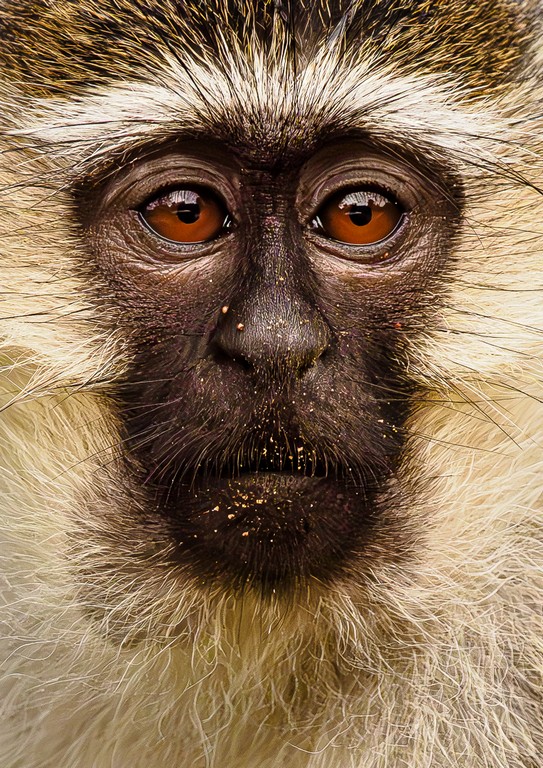
Of ‘Vervet Monkey’, also by Judy Sara the judge said it was all about the eyes. He suggested that with the chin dropping into shadow, cropping to mainly show the nose and eyes would really grab attention.
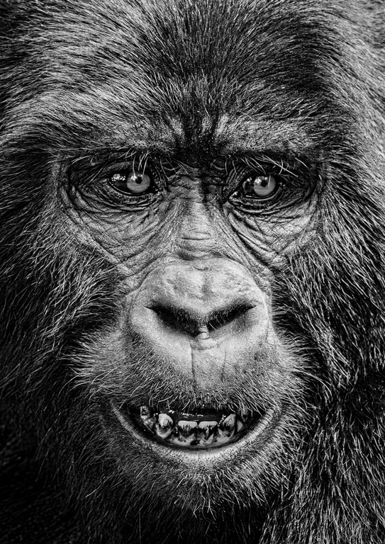
Continuing with the print section, for mono prints in the set subject, ‘Gorilla’, again by Judy Sara scored highly.
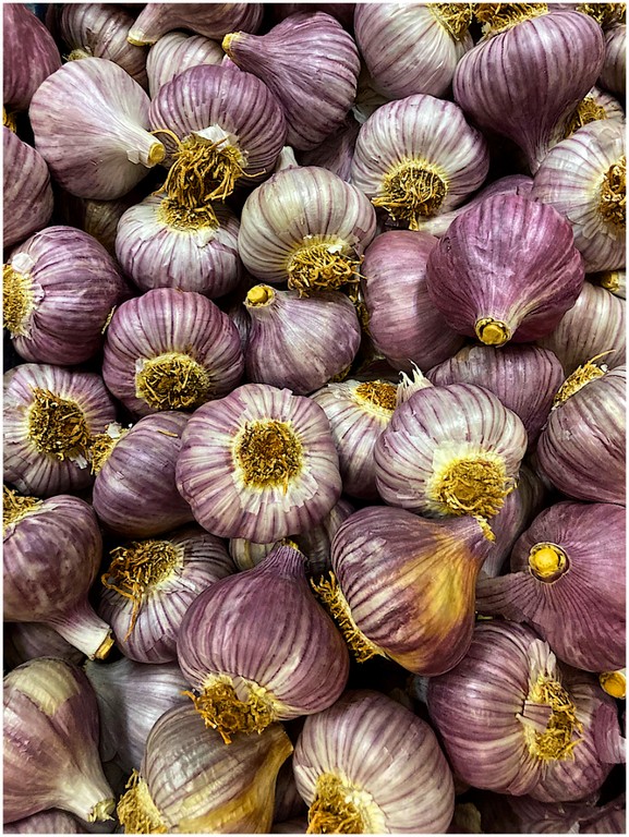
Moving to digital images for the Fill the Frame subject, ‘Garlic’ by Heather Connolly, scored well with the judge saying he liked it very much. He said the exposure and colour was captured beautifully across the photo with the one bulb with yellow tones providing a contrasting colour. The mix of purple and white stripes with the bulbs pointing in different directions made an interesting photo.
In ‘Scales’ by Kerry Malec the judge liked the effect, hesaid it was an ‘in your face’ composition, yellow at the bottom, but not super saturated, the viewer is drawn to the eye
Also concentrating on the eye is ‘Googly Eyes’ by Angela Cogman. Keith, the judge, said it was a fantastic underwater photo. He loved the sheer dynamism of the twist and curves, lines and textures around the eyes.

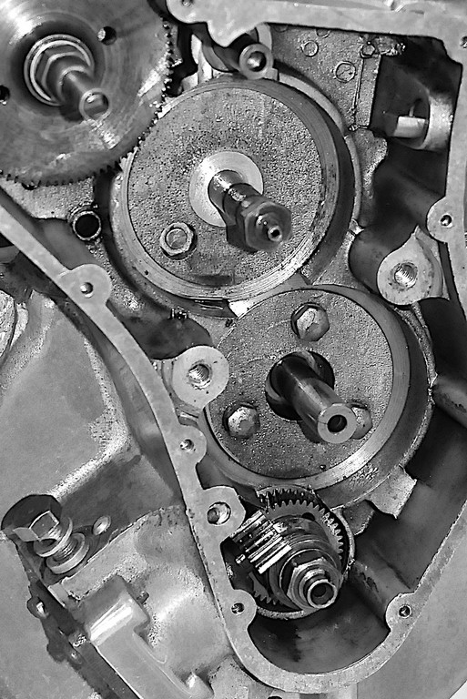
In the mono section of Fill the Frame, ‘Timing Case’ by Ray Goulter received a high score. Keith said it has beautiful black and white tones, good blacks and sheens heading towards white. There is a lovely diversity of mid tones. Compositionally there will be messy bits, but the strength of those four circular gears holds it together nicely.
In the colour print open section of the competition, ‘Contemplating the Waves’ by Duart McLean and ‘Pretty Boy’ by Di Gage both scored well.

Of Duart’s image the judge said there was a lot to like. He said it was really good story telling, well shot against the light with rows of wave action, and the photo had a sense of depth.

The judge said Di’s ‘Pretty Boy’ was a beautiful photo, a lovely portrait and beautifully exposed.
‘Having a Shower’ also by Di Gage also scored highly (digital image not supplied).
In the mono prints open section both ‘Tex’ and ‘Superjesus’ by Michael Selge scored highly.

Of ‘Tex’ Keith described it as a ‘Cracker’. A full on photo with no distractions.
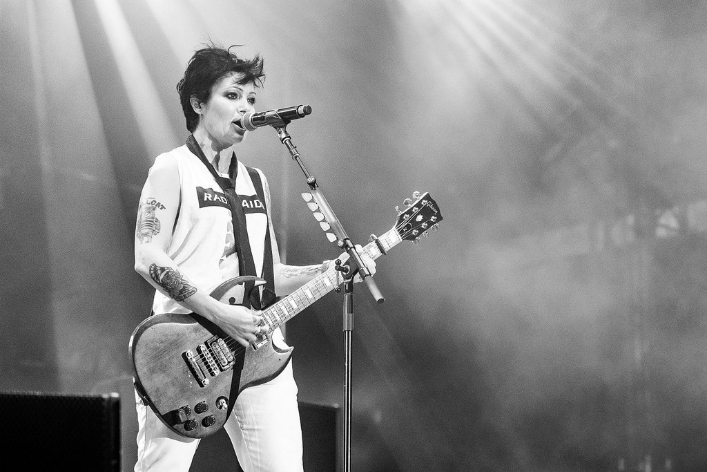
The judge acknowledged it is hard to get close to performers, and difficult to catch their ever-changing expressions. with ‘Superjesus’ He liked the catching of the smoke on stage and thought this image would work well in a rock magazine.
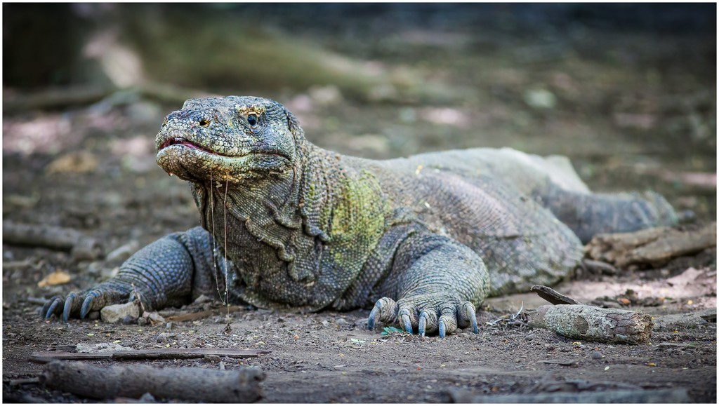
In the digital colour open section there were four high scorers. Leading the charge was Michael Selge’s ‘Komodo’ of which the judge said it had a good depth of field, the whole head being sharp and dropping off towards the back. The background was not distracting and the viewer’s eye is drawn to the head. He suggested the lighter spots could be toned down slightly in the background.
‘Daily Pitstop’ by Meredith Retallack had no distractions. The judge said it was well seen and captured with beautiful detail. He suggested the lightish patch on right hand edge of frame could be toned down and perhaps a couple of the plant tips could be removed in the bottom left hand corner to concentrate more on the bird.
‘Winter Solace’ by Helen Whitford scored well, with the judge saying the image was well exposed and he liked the backlight on the wine. He suggested a wedge taken from the cheese would make it look more real.

‘Ruddy Darter’ from Judy Sara was appreciated by the judge, saying it was a nice capture and really interesting detail. The brilliant red and black would stand out more if the lilac colour behind was taken to a more green tone so it wouldn’t be a distraction
In the digital mono open set Heather Connelly’s ‘Workshop’ scored well. The judge liked the patterns formed by the windows which melded with those from the roofline. The image inside the window gave the viewer a 3rd image to look at. He said it was a clever image which showed vision on the part of the photographer and it had lovely tones. He said it was well captured.

Scoring top marks with ‘Classics’ was Michael Selge. Keith said it was beautifully composed with great tones. The number 34 was still identifiable even though the car is out of focus and even with the different motions the shot was still sharp. He said it was a really well balanced motor sport shot

‘Trying to Sleep’ by Meredith Retallack scored well in this section as well. The judge said it had good exposure and it would be a difficult bird to capture as it has white feathers. He said the strength of the photo was in the stick with the broken bit at the end. He said it adds a dynamic element, counterbalancing the feathers of the head. He declared it was a good composition.

Judy Sara’s ‘Angles and Reflections’ scored highly. Keith said there were strong graphics in the angles and reflections, and the three way effect is interesting, forcing the humans to be almost silhouetted. He said it was a dynamic photo.


