
Blue for you – 29-Jan-2015
Blue – it evokes a range of emotions, has a range of meanings and is seen all around us. For some it is sadness or melancholy and for others it is calming and soothing. We relate blue to cooler temperatures. We listen to blues music, and often see it in corporate colours. In some cultures blue means a boys colour (but in others its for girls). It’s the colour of the sky and of water. Blue is often a favourite colour (no Monty Python quotes here) – or not – but that also depends on culture. Many people wear blue clothing (blue jeans!). It is the colour of an utterly insignificant little planet in the outer western spiral arm of the galaxy. Technically, blue is a primary spectral colour, with a wavelength of 450-495nm and RGB value of 0,0,255. Until the advent of modern chemical dyes, it was a difficult colour to reproduce and source from minerals such as lapis lazuli and cobalt or plants such as woad. Early photographic emulsions were overly blue sensitive making colour reproduction difficult which was overcome with the advent of panchromatic films.
But enough of the philosophy and history of blue. How about some photographic representation? There were plenty of people present to see how we could represent blue in our images – 40 members, 3 guests and judge Peter Phillips. On this occasion Peter had 108 images to judge (of which 45 were set subject). Peter seems to be making a habit of visiting our club at the start of the year as a judge – and that may be a good thing as he carefully and efficiently judged the images, giving some very good critique, sharing his insights, and handing out scores. As Peter carefully pointed out at the start, the scores he gave were his opinion – but the most important opinion was that of the photographer responsible for the image. Despite his warning – he did hand out a lot of very good marks (I counted eleven 10s and fifteen 9s – that’s almost 25% of the images). We also shared our usual club banter with the judge (there were a lot of puns and segues) making the night the usual friendly, relaxed affair we all enjoy.
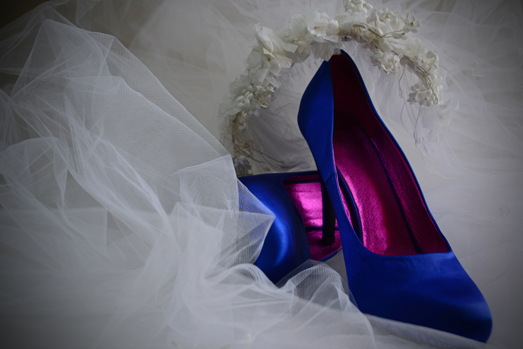
Jennifer Williams – Something Blue – Colour (Set)
So – how did we go?
Well the usual offenders obtained their expected high scores (and a few lower ones as well), but a few new faces emerged that will threaten the status quo! Jen Williams shook up the competition with the image at left. I’ve been watching Jen’s work on Flickr – and I think other BPC members should not be complacent. This image evoked no comment from Peter other than “10”. Enough said about that.
Gloria Brumfield is showing off her talent too with some great images. Dean Johnson again showed his ability with just one very clever image. David Hope gave us a stark landscape. And Perry Phillips took a punt in the novice section with some unusual images of silica gel (I knew what it was) – I hope we’ll be seeing more from him.
It was also good to see Theo and Ursula Prucha return to the club and get a few high scores in the process.
So – the first competition of the year is over. Check out the images that scored highest in the Top digital and Top print pages.
Cheers
Chris 🙂


