
31 Day Challenge – December 2017
A few dedicated club members undertook the 31 Day Challenge on Flickr for December 2017. We have done this each year since 2010 (wow – that long?). The idea if you haven’t seen it before is to take a photo a day and post it on the club Flickr page. No prizes other than a satisfaction in completing a fairly daunting task and keeping it fresh.
For me, it was certainly a challenge and I approached it in two parts. Firstly all posted images had to be black and white. Secondly, I tried to maintain a theme for a week to create a little photo essay (for later use). The second part sort of worked and I think I can get some essays together on commuting, street life and some dark imagery. But more importantly, I’ve had some fun along the way and got some shots I’m very pleased with.
The participants that managed to post a photo a day were Judy Sara, Jennifer Williams, Bruce Nankivell and myself. One notable near daily posters was club life member David Douglas-Martin. James Allen threw a few into the mix as well.
Both Judy and Jennifer tried the black and white treatment too – and the results were very good. Hopefully that means a few more monos next year in competition.
I had a look through the images and selected my top 5 – with myself excluded from that mix (conflict of interest!) and chose the following (click the image to see it full size on Flickr) with comments as to why:


How about you? What about selecting your favourite shots and telling us why? Click on this link to see the full set for the 31 days and choose your own favourites. Let the photographer know what you think as well or post here and share your thoughts.
Cheers
Chris 🙂
Straight from the Camera shall be the whole of the law or, is Photoshop for cheats?
Mark Pedlar has been doing some work on the rules that will apply to the Straight from the Camera competition. So to get you up to speed, I’m going to reproduce what he’s sent.
Let’s start with that supposed evil – Photoshop – and Mark’s view on image processing today compared to the days of film.
Straight from the camera shall be the whole of the law or, is Photoshop for cheats?
At the age of 12 I bought my first camera, a Kodak Brownie 127 – black and white, processed by the chemist. Only three years later I spent all of my first pay packet on a 35mm Halina 35X and I was into colour photography.
For four decades and through a series of cameras the vast majority of my images, family records, fun shots, as well as entries in national and international salons, were colour slides. In all of this there was one constant. Once the shutter button was pushed my images were pretty well set in stone. Whether I waited for Kodak’s yellow box or Agfa’s blue one to appear in the mailbox, or whether I processed my own in the kitchen, from 100 foot rolls of Ektachrome, the image on the celluloid could not be altered. The exposure, contrast and sharpness were inviolable. Composition could be modified somewhat by masking portions of the slide with aluminium foil. However, this was obvious since the projected images were smaller than others in the salon. So, over these several decades more than 90% of competitive colour slides, worldwide, were “Straight from the camera”.
Of, course this did not in any way mean that everybody was operating on a level playing field. Those using a ‘top of the range’ Nikon with a battery of excellent lenses would be able to capture some images simply not available to my $50 East German Praktika: multiple exposures on one frame for example.
Today’s ‘top of range’ cameras similarly offer rafts of pre-exposure adjustments simply not available to the user of a basic ‘point and shoot’ camera. The playing field was never level. Further, the greatest unevenness always has been and will be the way in which the operator uses the human brain he or she puts up close to the viewfinder.
‘Straight from the camera’, then, has long been the accepted practice of slide producers. However, that’s not true of users of negative film and prints. Again decades ago I bought a whole darkroom from an ageing amateur/professional photographer from Brewarrina. I used it for monochrome exclusively. Colour printing was way outside my budget. However, printing from negatives was exciting for a range of reasons; not least of all the ability to modify (and hopefully improve) the image originally captured before it became a print.
So, I cropped the portion of the image I printed to change the composition and to remove distractions like lampposts or stray arms and legs. I held my hands between the enlarger lens and the paper making a circle of light between my fingers. By doing this during the exposure and moving my hands a bit to blur the edges I could allow extra light to a portion of the image. This meant I could ‘burn’ in details to what would otherwise have been a white area (clouds). I had a small circle of cardboard Sellotaped to the end of a piece of wire (once a coat hanger). By holding this between lens and paper (dodging) I restricted the light falling on a shadow portion of the image and allowed detail to appear in what would have otherwise have been totally black.
I chose whether I printed on matt, satin or glossy paper. I chose the paper grade to give me high, medium or low contrast. Later there was multigrade paper whose contrast was adjusted with filters. I chose exposure times to change the final result. I selected developers and their temperature to change contrast. I deleted most of the developed image before fixing using ferricyanide solution and redeveloped to convert the black and white image to sepia. My ancient photographer’s darkroom kit contained a huge range of arcane solutions including some of gold salts that enable black and white to be tinted blue.
All of the modifications described in the last two paragraphs were made after the shutter was released; after the camera had long ago been put away in its cupboard.
So, what are the take home messages? There are two.
First, excellent images can and have for ages been made without any post-exposure modifications. There really is no replacement for getting it right in the camera. However, even if we prohibit ‘post’ work like Photoshop competitive photography will still not be a level playing field.
Second, makers of prints from negatives have been modifying their images in the darkroom during the printing process for over a hundred years now. When did you last hear somebody suggest that this is unethical or underhanded or cheating? However, there is a body of opinion that makes just these sorts of suggestions about the use of software packages like Photoshop. Why? Not all users of editing software are out there winning competitions, exhibitions and salons. Software does not automatically give you great results without effort. Software is a tool and you need to learn how to use it just as was the case with darkroom techniques.
So, get your image as near perfect as you can in the camera. Then make judicious and competent use of whatever other tools are available to correct errors and finish the job.
Now for the rules (which I’ve also put into the calendar and programme)
Straight out of Camera Submission rules
During the submissions to the club’s subcommittee back in the Spring several members said they had concerns over the emphasis placed by judges on post exposure editing or manipulation of images.
Some were opposed to the concept of editing and others simply had no access to the software to edit images. There was a cry for more images to be presented “straight from the camera”, with no editing carried out after the shutter button had been pushed.
This competition’s set subject is a response to that request.
So here are the rules.
For prints, no alteration AT ALL may be made to the image after exposure and before printing.
- Printed images must be presented full frame. No cropping is allowed. If the image shot is 4:3 format or 3:2 format it must be printed in that format.
- Images must be printed from the file originally captured by the camera.
If you usually shoot in RAW you must be able to print from that RAW file. It may not be converted to JPEG TIFF or similar for printing. Or, shoot in a printable file format.
For those having files professionally printed, the file submitted to the printer must be printable without alteration. - Prints displayed as monochrome must have been captured in that form.
- The general club rules about size of prints still apply.
Digital images are allowed one alteration only. This is to allow the projected image to conform with our projection limitations
- The recorded image file may be reduced to maximum of 1400 x 1200 pixels. It must still be presented full frame.
- All the other print rules apply to projected images.
Finally, I’ve taken one of the documents Mark sent me about photography & aperture and made it a permanent link in our Resources page
Thanks Mark
Chris 🙂
A night of positive Judging – 28-Jan-2016
Our first competition for the year on Thursday January 28 was a great starter for what promises to be a busy and stimulating 2016.

Rigging – James Allan
The subject for the night was ‘Leading Lines’, which is a composition technique where the viewer’s eye is led into the image. Our judge was David Rowlands from Edwardstown Photography Club and what an encouraging and uplifting judge he was. With a significant number (115) of impressive images to work through he did so with a burst of positive and constructive feedback for every one of them. His comments were well considered, informed, concise and articulate.
Regardless of how your photograph scored you felt like you’d both learned something positive from the commentary and you were left inspired to reach greater heights.
With our constantly growing club the evening was well attended (about 45) by a welcoming and appreciative audience all very keen to learn.
First time entrant, Di Gage presented us with two inspiring images, one of a very beautiful soft Victoria River sunset and another of a fishing boat and its perfect reflection complete with bird resting obediently on a rope. A perfect start with one image scoring full marks. Another relatively new entrant, Robyn Due, was justifiably excited to score a 9 for her Port Adelaide excursion image, entitled ‘Pot’ a well spotted image of paving, posts and buildings providing interesting leading lines.

Pot – Robyn Due
Some of the excellence of our seasoned performers was on display with the likes of Alberto Giurelli, Helen Whitford, Jenny Pedlar, Ursula Prucha, James Allan and Chris Schultz
Mark Pedlar’s image (below) entitled Cornwall’s Motto captured, for those who weren’t there, the area in which the recent Port Adelaide excursion took place and plenty of Leading Lines. A quite stunning shot.

Mark Pedlar – Cornwall’s Motto
The following are more of the high scoring ‘Leading Lines’ images from the night.

Kelp – Heather Connolly

Port River Dolphin – James Allan

Nestled Farmhouse – Judy Sara

Blue Moth on Sunflower – Ursula Prucha

Nation Ridge – Chris Schultz

Fishing – Jenny Pedlar

Arches of Light – Bruce Nankivell

Follow the Leader – Helen Whitford
To see more great ‘Leading Lines’ images visit the ‘Top Projected Images‘ and ‘Top Prints‘ pages.
It seems to me that photography is one of those games where just when you think you’ve nailed some small part of it you are instantly reminded via someone else’s display of skill that you really haven’t and there is a long way to go. I’m convinced it is a never ending story of learning and I guess that’s why we all love it.
Makes you wonder what kind of fabulous circles we can create with our next competition, entitled ‘Circles’, of course.
Bruce Nankivell
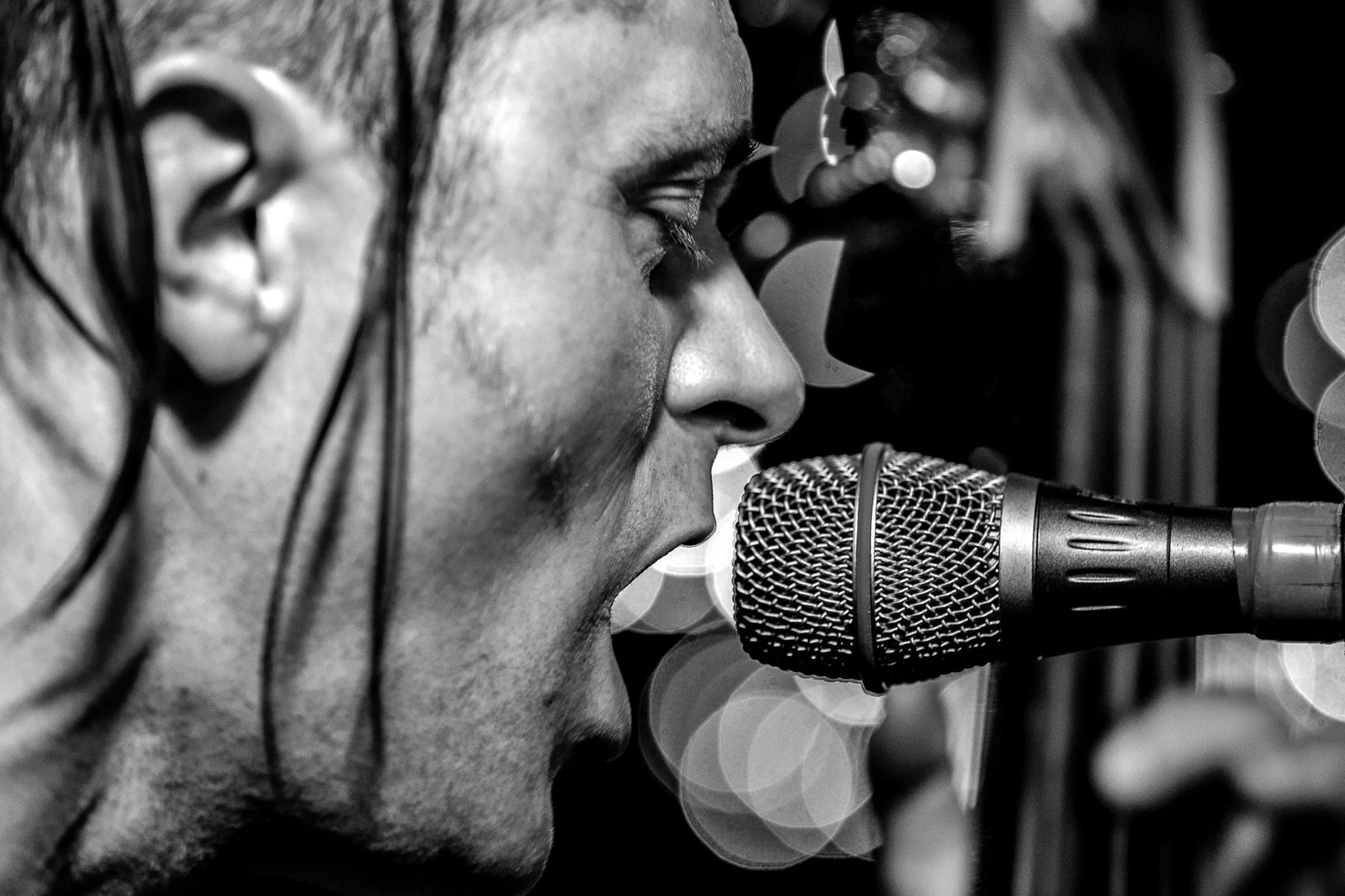
BPC presents – Chris Oaten : Live Music Photographer – 22-Oct-2015
Last week BPC had the honour to listen to Chris Oaten speak to us about live music photography. Accompanied by his wife Melody (who provided the background commentary), we had a very entertaining evening that inspired a few of us to take up our camera at a live gig or two.
Chris is a media professional with over 20 years in the industry. Starting from a base of journalism (reporter, writer, sub-editor) he has followed his passion of photography to become a full time professional photographer, is a member of the AIPP and in his spare time photographs live music (I’m sure he does other things in his spare time!). He has extended his knowledge with a TAFE course in photography and is now doing a Bachelor of Visual Communications at UniSA. The night he spoke to us he was due to go to 2am shoot at a construction project. That’s a pro.
Chris Oaten at BPC (Ashley Hoff)
His range of professional work encompasses architecture, sport, travel, humans, commercial and time lapse images. He specialises in time lapse images around our fair city. To view the breadth of his work visit his website.
But as I said, in his spare time he likes to shoot live music with his trusty Canon 5D Mark III and some fast lenses (his range of lenses includes 24mm, 50mm, 70-200mm, 8-15mm, 16-35mm, tilt and shift 17, some Sigma Art lenses – you get the idea – but not all are used at music events). He does the music photography for professional development – not to make a living – which is near impossible these days. You can see some of Chris’s music photography on the Adelaide Music Photography web site he showcases his collaboration with Max Moore.
I’ve watched Chris in action around live music gigs – and to me it seems effortless and unobtrusive. In reality, there is more to it – and what follows is Chris’s take on how to shoot live music.
Chris started by giving a taste of the problems in photographing live music in pubs and has to deal with poor lighting (professional performers often have far better lighting and make the job easy – we were shown some images from a Tina Arena concert), crowded venues etc.
So here are the problems Chris sees – and his solutions:
- Don’t share boring photos!
- You aren’t doing any favours for anyone. So edit what you share ruthlessly and be prepared for harsh criticism.
- Remember, that your photos don’t have the music that goes with them, so they must stand on their own.
- That means they need to be in focus and they need have the action associated with the photo – singers need to be singing, musicians need to be playing their instruments.
- Don’t use on camera flash
- It is needed sometimes, but very rarely
- Don’t use high ISO where possible
- Cheaper cameras can’t do it well, it pushes inaccurate focus
- Hiding noise results in a compromise (over smoothing looks like plastic!). But there are ways to overcome this issue
- Understand your subject
- Good sports photographers often play the game, great nature photographers understand the animal and their behavior etc.
- So in the case of music, understand the dynamics of what is happening on the stage and apply it to the action.
- Not shooting enough frames
- Don’t use spray & pray – that high burst mode – as it will often waste time (eg as the buffer clears) and wear out the shutter sooner. Single shots are better.
- Remember that most of what is happening is out of your control
- To get the shots you need to be an aggressive shooter. What is that? Someone who moves around and makes the shot rather than someone who walks up timidly to the same spot, takes a few shots and walks away. Music photographers need to move around and capture the action, be involved, engage with the artists
So what is Chris’s style? Get in close, use the lighting to your advantage and use selective (ie shallow DOF) focus, often manually.
So what are his solutions?
How not to be boring
Live music is action photography. Instruments are being used. So get profile shots, stick with the subject as the action unfolds.
Bad lighting can be your best friend – it makes you work harder. There is no such thing as bad light – only bad photographers. Chris showed several example of this with the band Lucky 7 at a gig where there was one light behind the artists. Instead of abandoning the shoot, he used the light to create profiles and silhouettes. Think of old horror movies and how they were lit – the images had great power and atmosphere. Do the same.
On the other hand, daylight music festival are a breeze – but you still need to work hard.
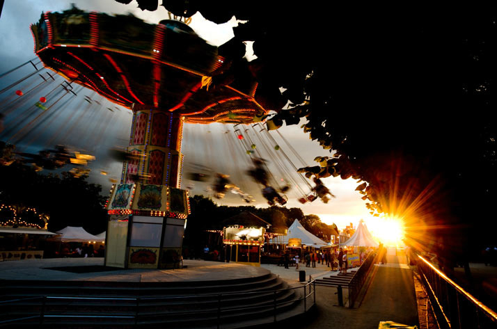
Steve Mitchell – by Chris Oaten
Change your position and angle of view. Use the stage equipment to help frame shots. Remember, the photo is telling a story so use the elements of that story. Chris showed us an example at the Semaphore music festival – which unfortunately for the organisers was held on a AFL Finals weekend. The crowd was a bit sparse, but by moving around the stage he was able to make it look busy (using the out of focus background and more crowd), show interesting on lookers, the artists in action from in front, behind and to the side as well eye contact with the artist to lend intimacy to the image.
He quoted photographer Berenice Abbott “photography helps people see” and illustrated this with some great shots:
- a young boy at his fathers gig enjoying the music whilst sitting on the floor
- The interaction of musicians on stage when not playing
- People dancing to the music (and those disconnected from the action) – the burlesque dancer picture
- Interesting people and characters
- Portraits of musicians that they actually like
It’s important to remember that good photographs are enhanced with details – they add depth. That means when taking photographs be observant. Some of the examples acutely demonstrate this:
-

Steve Mitchell – by Chris Oaten
Steve Mitchell from the rockabilly band The Satellites has hair that starts out controlled, but very soon is part of the act
- A musicians special moment – like Belinda Hartman – from The Satellites singing
- the musicians style of playing – like a trombone players blowing their cheeks (or giving cheeky looks) or guitarists with special (eg car seat belt) guitar straps
- Use
- compositional elements
- portrait shots of the performers
- (our tired old friend) the intersection of thirds
- selective focus
- the Golden Spiral – where a photograph spiraled in to one person in focus around the instruments and equipment on stage
- close up features of the instruments or instruments being played (trombone players, guitarists – but drummers are difficult!)
The trick here is to apply what you learn – don’t just be a technician. As Chris said, don’t just be a wood pusher in a chess game (ie know the moves but don’t develop new strategies). In photography, pixels are free, so don’t be a shutter pusher.
How to use on camera flash
Flash does have a role in anti-establishment genres such as Punk and Ska. It is harsh lighting, but can work in such genres. However, at other times it rarely works well.
It’s often better to have off camera flash – and even combine flashes. Chris illustrated this with an image of lighting reflected from a white wall behind the performers onto which the flash fell – much more depth than a straight flash onto the performers.
If you must use flash, use a an orange or yellow gel to warm it (flash can look very cold) – don’t use green or blue. You need to be sympathetic to the available light too – don’t overwhelm the stage lights.
And use the lights to go for drama – like silhouettes or use the light to make more reflections – such as brass instruments.
How to handle high ISO
You’ll need to do some testing of your own camera gear and work out it’s noise signature. What is acceptable and what you can tolerate. Chris rarely goes above 3200 on his Canon 5D Mark III.
Here are the steps:
- Place your camera on a tripod in a lounge room and shoot some still life. An 18% grey card may be helpful too
- Shoot images at each ISO from 800 to your camera’s maximum
- Evaluate the resultant images and determine what is acceptable to you
If you are using high ISO, make sure you have fast lenses – f1.8, f2.8 etc – like his 70-200 f2.8
One simple solution is to purchase a 50mm f1.8 lens second hand – there are plenty about (I confess to having a nifty 50 f1.4 myself) – that will give you a lens that is fast and flexible.
ISO changes are needed depending on the speed of your subject – a Bob Dylan is ok with slow ISO, but Mick Jagger needs higher ISO and shutter speeds.
Now the tricky bit – professional events have good lighting – pubs have cheap lighting. Usually LEDs and that is hard to work with. So work with the light – use blur, have long exposures to add a dynamic element.
How to work with your subject
When photographing live music you need to know what is going on – understand the dynamics of the performance.
You first need to understand the genre. Once you’ve got that, then think about the parts of the performance.
There are verses and choruses. So you’ll have a group in a chorus, but the main performer in the verse, or a solo instrumental. Knowing how performers work and when they are likely to do something can help.
For example Steve from the Satellites (who is a double bass player) often has a big finale – time your shots for events like that. Lucky 7 have a horn section who will play together – use that.
Drummers are often left out of shots, but they do some interesting things (Chris has got know a couple and now interacts with them whilst shooting). Pick the player most likely to give you a performance.
But always be respectful of the performer. Don’t embarrass them.
How to shoot more frames
You need to commit yourself to chase the right frame and for fast action.
Most performances are 2 hours – which is 7200 seconds. After most shows Chris has about 1000 shots in the camera. That’s about 1 shot every 7 seconds. But not every shot is a winner – and some shoots the band might be having a bad night, so getting good shots is difficult.
Many bands will be slow to start (or nervous) – so don’t shoot song 1 – wait for song 2 or 3. Be patient.
Final words and where to start
Chris never shoots with any supports like a monopod – all hand held. That is part of being respectful of the audience. They are there to hear the band or dance or both. So don’t get in their way.
Some gigs require a media pass – if the band is signed to a label or it is a major event like WOMAD (who are very restrictive). The Roller Derby in Adelaide has photographers sign their rights away. In some cases your copyright may be lost – but that is another major discussion!
Venues such as The Gov are accepting of photographers if it is a local band. However, to be safe, contact the venue or the band. Many local bands don’t mind – and if you share the images they might even get you back.
And remember a big camera can be seen as problem by some venues – even if you are an amateur.
So there you have it – a great night, lots of useful information and a really entertaining evening – finished off with cake, cups of hot beverage and lots of chat. Many thanks to Chris and Melody for sharing their experience – we hope to have Chris back as some stage to share his other photographic skills with us.
Cheers
Chris 🙂
Art – the dilemma of the photographer
The perennial dilemma of the modern photographer – should I photograph that bit of art I admire?
We are faced with this daily – from photographing sculpture, architecture, industrial design or paintings to painting someones photograph (now that’s one you hadn’t thought of!) or sculpture or industrial design or architecture.
There are also potential copyright issues. The simplest way to look at the problem is to consider if it is a derivative work and you’ve added something to it. So a photo of a sculpture needs to add something to it – a person examining it, some interesting light that makes it unique, the interaction of place, time and light. How about a photo of a hood ornament on a car? A teacup? Someone else’s photo of a tea cup?
Some places & countries even go to extremes and forbid commercial (and probably amateur) photography of buildings, panoramas etc without permission. A debate raged earlier this year as Europe tried to standardise the copyright of Freedom of Panorama (see this DP review article). Have a look at the Wikipedia page link above to see where you can take pictures safely. The conclusion was a defeat of the proposal – you can keep taking photos of the buildings of Europe (sort of).
But if you change or interpret the original, you are deriving something new. And that I think is the crux of the argument.
There are many discussion on the web about the topic (the World Intellectual Property Organisation – a part of the UN – has an interesting article applicable to photographers; the Creative Commons licence system; the US governments Copyright office definition of derivative work or the American Society of Media Photographers discussion) and we are adding to that in the latest Camera Clips, where the opinions of camera club judges, photographers and legal experts have been canvassed.
Have a read and form your own opinion.
Cheers
Chris 🙂
El Presidente’s musings – October 2015
Right – so you wanted the web page to be updated regularly! I heard you. So to try and add some life to this site, I’m going to have a little article at the start of each month with most of the content (I’ll edit out the the routine stuff that doesn’t need to be repeated) from my El Presidente’s Musings emails from the last month.
21-Sep-2015
Well after the AGM, it’s time to get down to the serious business of enjoying our photography some more!
So first up, some house keeping:
- Peer Review – in the almost standard format. Bring your prints, bring your digitals. Remember, this is for constructive discussion, so don’t be afraid to share even if you’ve never shown something before.
- The Annual Exhibition is coming up. We’d love to have your images displayed. Don’t be shy – show us your best. This is judged by a panel off site, so you’ll get a score and maybe an award. I’ve attached the form. Here are few details
- images will be judged on 7-Nov-2015 (in private) for the results to be displayed on 19-Nov-2015
A reminder of the rules etc:- Each member is allowed 3 entries per section in the Annual Exhibition – and entry forms must be handed in by 22-Oct-2015 or emailed to the BPC secretary email address – blackwoodphotoclub@gmail.com by 28-Oct-2015 (so that we can be organised for the judging of the exhibition on November 7). This is for ALL entry nominations. The print entry email address is NOT BEING USED for the annual.
- The Entry Form is attached to this email, or can be obtained from the website, via the Forms page
- Prints/slides must be delivered for judging by 5-Nov-2015 (the night of the final Peer Review of the year)
- Digital entries must be emailed to the BPCdigitalentries@gmail.com account by midnight on 4-Nov-2015 – entries sent to any other account will not be considered. You have been warned!
- Entries are open to financial members of the Blackwood Photographic Club. Entries must not have been entered/displayed in any previous Blackwood Photographic Club Annual.
- We also have the Australiana Landscape Trophy
- only 3 Digital Images section entries are allowed in the Blackwood Photographic Club Annual Exhibition
- One of the the 3 images entered in the Digital Images section may be nominated for the WEA APC Australiana Landscape Trophy and should be identified as such on the nomination form
- The image must meet the following definition:
-
Objects and/or people that are part of the Australian rural landscape and tell a story about that landscape may be included. The image need not conform to traditional landscape images and could highlight a significant natural feature in the landscape such as a cliff face, gum tree, mountain side, riverbed etc. Close ups of a feature against a plain background are not acceptable
- Eligibility for acceptance is to be adjudicated by the Digital Images Entry Secretary based on the definition
- Normal judging will occur of all images in the Digital Images section
- The highest score for the images entered in the Australiana Landscape Trophy will be awarded the trophy
- In the event that 2 or more images achieve the highest score, the judges will be required to choose the best of the images achieving the highest score
-
- A reminder to everyone to return the trophies/plaques you may have won from last year so they can be engraved as soon as possible after the Annual Exhibition Judging – by 23-Oct-2015 please
- images will be judged on 7-Nov-2015 (in private) for the results to be displayed on 19-Nov-2015
- The Bill Templar Award nominations are also required by 28-Oct-2015 (sent to blackwoodphotoclub@gmail.com) or 23-Oct-2015 (in person to the committee). The winner will be announced at the Annual Awards night.
A reminder about the Bill Templar Award:- This award is for the Most Outstanding Contributor to the club as voted by the members – so think about who you think deserves it.
- Voting (if required) will be conducted (by email or notes to a committee member) and will close on 7-Nov-2015 (the night of the Annual Exhibition judging)
I also thought a rough summary of the discussions raised at the AGM might be in order too. So here are a few thought bubbles (not in priority order and probably not complete):
- The discussion forum idea has a lot of merit – it would be good to ask questions and get some help when needed. Flickr has limitations, but is pretty open – but it’s not the perfect vehicle. A closed Face Book page makes sense too. That could be used to gather opinion as well. We’ll need someone needed to moderate it though.
I think the committee should have a discussion but if you have any ideas please pass them on. And let’s not make the moderator one of the regulars – if you’re interested please let us know. - Outings and email lists – the Face Book page could work. Julie informed me after the AGM that Kerry and Graham have started working on the week day outings process.
In the spirit of all our other email accounts (Secretary, President, Print & Digital entries), we should probably set up a BPCoutings@gmail account. The outings coordinators can then send out emails to all as a BCC (as we do now) - Member details etc. We maintain a spread sheet, but regularly run into the problem of incorrect emails. We’ll be making a serious attempt to update this as we need to have it current, and then ensure that emails (as the main form of communication) are current.
- The issue of copyright and intellectual property is important. Thanks to Ashley for discussing it and giving some perspective to those present.
It is fairly easy to capture images from a screen – if you can see it you can get it. We will persist in only loading images that are no more than 1024 x 768 and 72 DPI. However it needs some education for all and we’ll prepare some guidelines indicating how to both protect and share images. - Competition definitions – is going to be hard work. We’ll try to improve that for both clarity and to reduce ambiguity. We need to have the ideas and their descriptions BEFORE we set the programme and get the judge coordinator to guide us. In the meantime, please send us any idea you have – and make sure the definitions are tight.
- The novice section needs a bit of thought. I like the yellow dot that Alberto & I mentioned – and the digital Novice section. Historically, the Album prints were the novice section, but digital is perhaps an easier way to enter.
But who is a novice? How many times you’ve entered? How many points you’ve accrued? How long you’ve been a member is a bit simplistic.
Perhaps a combination – not experienced elsewhere, a number of entries AND scores achieved to work out an average score. When a threshold is reached (it could be several) you are out of Novice and into main stream. It does need a sunset clause – you can’t stay novice for ever.
So 2 years max or an average score > 7.5 or 50 entries? Or some combination of all?
However, the yellow dot (unlike the novice digitals) probably shouldn’t mean easier scoring – but it should mean more constructive comments from the judges.
If you have any thoughts about a novice section please let us know - Web page – yes it is a bit stale at times. Are there any volunteers to do write ups? We might tap you on the shoulder and as for a few paragraphs and post them. We will request write ups from someone before the meeting so they are primed.
If someone has a burning desire to be an editor please let the committee know. - Peer review – has been evolving but needs some more work. The impression I get is everyone likes it. The idea of photo essays seemed to work well, and we have also considered an essays on photographers that inspire you. I think the round tables have worked well too. So we’ll mix it up a little more and see if we can evolve it further.
- New & younger members – we need to find a way to appeal to them. What do you think? How can attract new members and freshen our thinking? Our club has a proud history of being different – and new ideas help that. But new ideas are often brought in from outside.
We’ll send out the complete minutes to you soon – while the AGM is relatively fresh in your mind.
Finally, here are a couple of web pages I’ve been looking at lately with some interesting thoughts:
- https://fstoppers.com/education/ten-exercises-become-better-photographer-84261
- https://fstoppers.com/critiques/how-properly-critique-photograph-82407
28-Sep-2015
What a gloriously sunny and warm weekend! That should shake off the winter blues!
I hope those that went on the club outing to Mannum Falls had a good time – I was doing some work around the house that’s been waiting for sunshine! I’ve already seen a few images on the Flickr group – more to come please! Bruce has posted a piece on Camera Clips webpage……
We certainly had an interesting critique night last week. I was really pleased to see so many interesting images. At least 90% of the images displayed were competition level – and the rest just needed some tweaks (in my opinion – see the web links below)! Well done – hope to see them in the Annual (if not before).
So on to general business
- On 22-Oct we have a guest speaker – Chris Oaten – who will talk about photographing live music. I’ve seen the outline of Chris’ talk and it looks like we are in for a treat. Remember to bring a plate to share.
- Kerry has sent me an email about the Festival of Architecture and Design (see www.fad.org.au) which runs from 8-Oct-2015 to 13-Oct-2015. There are lots of free events (and some you’ll pay for like a tour of the infamous Z ward). Check out the web page and the program (see http://media.wix.com/ugd/9a1163_c452827a6dbd4404bc766f11f172406f.pdf) to see what is covered.
- On the topic of outings, if you have any suggestions for outings, please let me know and I’ll forward them to Graham, Kerry or James (we’ll be setting up the BPCoutings account shortly – I’ll let you know when its up and running)
Finally, some more interesting articles to read:
- http://petapixel.com/2015/09/05/why-you-should-always-make-time-for-personal-projects/
- http://petapixel.com/2015/09/06/10-famous-street-photography-quotes-you-must-know/
And two that shows the variety of image capture and perception:
- http://petapixel.com/2015/09/22/the-minimalist-bw-self-portraits-of-noell-oszvald/
- https://fstoppers.com/bts/20-photographers-are-given-same-portrait-edit-check-out-results-88063
5-Oct-2015
Well I hope you’ve had a great long weekend! Been a tad warm. I’m sure we’ll see lots of images from the long weekend, including the Flinder’s Ranges outing soon.
Unfortunately, I missed a lot of the weekend – had to work both in the office and interstate 😦
But I did get a few shots in from the Oz Asia Festival (my wife and I were part of the mega crowd) and had some fun in China Town in Melbourne last night (had to work in Melbourne today….). Once again, I’ve been inspired by night shoots which show a different side to the cities you know. Hopefully the outings masters will organise a night shoot whilst the weather is warm and give you all a chance to play in this wonderland of light and shadow.
So on to the routine stuff:
- This week is the Shadows competition (not the band from the 60s!). The digital entries have closed but you can still enter prints by sending the subject and the titles to bpcprintcompetition@gmail.com by 7pm Tuesday night
- Don’t forget the Annual Exhibition and Bill Templar award – we already have an Annual entry form from one enthusiastic member
- Next meeting (22-Oct) is our guest speaker Chris Oaten – all about live music photography!
And now to a some interesting web links again – this time about 2 different photographers – one current and one regarded as a father of photography as art.
I like to listen to podcasts when travelling on planes (the in flight entertainment is pretty average!) and rather like Ted Forbes The Art of Photography
Ted has some interesting conversations and the two that have taken my fancy this weekend have been on street photographer John Free (visit his website for lots of images and idea) and another on Ansel Adams (you can also view some images of Adams work on the site).
Most of you know my opinion regarding photography as more than just a picture that some judge likes and these two podcasts reinforce that. John Free tells stories with his street photography with (as he puts it) trying to (and I’ll paraphrase it) generate an emotion from your photograph and not just a print, whilst Ansel Adams escaped the pictorialist view of early photography clubs and created art with his landscapes. In both cases, photography has moved beyond the purely technical – although the technical needs to be understood to achieve their outcomes – and on to a higher plane. Something we should all aspire too. Have a look and tell me what you think.
Cheers
Chris 😉
Judging – the first time!
The first judging at a photography club! Scary!
Alberto called me on Monday of last week – could I fill in at the last minute for a club south of Adelaide? According to Alberto, a bit of a trip, but they were a friendly crowd, a bit like our little happy troop. So on Friday, Alberto and I trekked down the Victor Harbor Road on a wet foggy night to South Coast Camera Club.
On the way we discussed (amongst other things) judging and how to be consistent. I’d re-read my judging school notes over the last few days, and thought about what I was trying to give back. There was lots to think about, and I didn’t want to be the type of judge I had complained about.

Camo Frog – Brad Hodge – South Coast Camera Club
On the night, about 40 people were present, and about 100 images ready to be judged! Now I was scared – I’d been told there would be about 50 images! They must have heard there was a gringo judge coming down! Competition Secretary Brad Hodge, President Andy Mitchell, Vice President Mike Gillies and Club Secretary Wendy Hodge greeted me and led me through the procedures and informed me about the 100 images. The gringo judge was ready!
Brad and Mike presented the images and to be honest, the image quality was very good – similar to our little group. I had spent 10-15 minutes looking at the images before judging started to find what I felt were the top ones – judge between what is there on the night as Keith Seidel kept telling us at judging school.
The set subject was Macro – something I feel I do well. However, Brad led with Open Colour – so it took me a while to get into my rhythm. When we did get to the Macro prints, I’d already judged 40 images and I’d done my homework and felt better about this set. Moving on to set mono prints was a doddle in comparison – just a handful of images there. Digital was harder as they weren’t divided into set or open, and choosing the best after 1 pass is no fun at all. That’s one reason I always give the judge at least 5 seconds to look at an image (time me next competition). All the time, I tried to keep it light and put in the odd one liner or joke. President Andy scored a few references from me (he started it when this horse image was shown at the start!).

Whatya Doing? Laura Wright – South Coast Camera Club
It’s amazing how you need to find the faults to tease out the scores. Yes – I dropped marks for poor focus, softness in the wrong place, composition that broke up what could have been a good image, not being close enough (Robert Capa strikes again!) and distraction (aargh – highlights!). I also docked marks for confusing or difficult images. Was that wrong? It is difficult to be consistent when there is such a broad spectrum of images. I did offer them the chance to beat me up after – in an orderly queue. To help novices, SCCC give the judge a little hint as to who is a novice – as a cue to increase the feedback – with a little yellow tag. And to be fair, a lot of the novice images were actually very good – and scored well.

Summer Snails – Janet Harbottle – South Coast Camera Club
Some images just didn’t click with me, and finding the right words is very difficult when you want to be constructive. However, in the end, I felt I had done my best, and no lynch mob lined up outside to give me rough justice in return.
Like our club, there were more colour prints than mono. There were fewer macro images than I expected, but I gave it my best shot. Some weren’t quite macro, but Brad requested I be flexible.
I did change my score once or twice (bad boy!) and dropped the dreaded “step to the left” comment once (it really did need it – but I qualified it by prefacing it with “many judges would say”). Nerves were part of it – but then again I can talk my way out of most things given time, and I felt I did get more consistent. Alberto coached me from the sidelines between sections (a bit like a footy match) and gave me the thumbs up when I got things right, and a subtle shake of the head when I didn’t.
My spread of marks was probably a bit high to start with (why so many 8s?) but I did settle down. I don’t think I handed out a 5, but a few images scored only 6.
SCCC finish each section by getting the judge to choose the Honour (one of them – thank goodness I handed out only one 10 in each) and Merit images (3 – I handed out too many 9s) and at the end of the night the image of the night from the top 4. Talk about putting me on the spot again!
Fortunately, when all was done and dusted, I felt I’d given out top scores to the best images, and given some reasonable and constructive feedback. And exhaustion was setting in. Remarkably, 90 minutes of judging flew by.
The night finished with some supper – a short talk from me on macro stacking, and the usual thank you’s etc. The stacking talk resulted in an invitation to come back for a workshop. I hope I’ve made some new friends at SCCC!
On the trip home I had my debrief with Alberto. Pretty good for a first time and I gave the top scores to what he would have. A few things though – don’t change the score, try and keep the constructive comments up as much as possible – particularly with the really difficult images, don’t refer to other images with faults as an example of why an image worked. Ok – I need more practice.
I dropped Alberto at his house at about 11:45pm – and got home at about 12:15am. I couldn’t get to sleep. Had I given the images the justice they deserved? Did I offend any one? I hope not. I had probably dropped a couple of clangers and as I said, tell me what you are trying to achieve.
Overall, I was reasonably comfortable with my first effort – not perfect, but not disastrous. I’ve learnt a few things and appreciate the effort good judges put in more. I promise to try harder for more consistency and constructive comment. I need to make sure that even the most difficult image gets given a positive comment. If I don’t – let me know!
Chris 🙂
Judging – fighting the battle from within the parapets!
This little web page has been a source of much discussion – heated and rational – about the judging standards in photographic clubs. We aren’t the only ones, but in our little corner of the world we were a squeaky wheel.
Our web page and the articles (in March 2011 and April 2014) about judging have been used as ammunition in a battle both in South Australia and South America (I kid you not). There are probably others (drop us a line if you did). I’m sure many people have read our blog and nodded or shaken their heads. Felt our pain. Shared in the angst of inadequate judging.
The discussion began due to the frustration many of us felt about the quality of photographic club judges. They seemed mired in the past. The technical aspects were the only thing examined. Trends in modern photography ignored. Were we pursuing art or were we aiming to be good technicians? I confess that I’m one of the instigators of this discussion. I had seen my photography decline as I tried to please a bunch of people that to me seemed locked in a time warp somewhere around 1970. I realised what I was doing and started to climb out of the abyss. It took some time.

The squeaky wheels – not just our little club – started to be heard around the photography clubs in this state. Judges were discussed in both whispers and loudly.
How could we change things? We discussed this many times. The suggestion – change it from within. “No” many of us cried. “Too hard”. “Don’t have the time”. “It’d be a lone voice lost in the wind”.
At the same time, the SAPF executive noticed – and set about reform and change. Training more judges. Getting a broader range of opinions. Keith Seidel and John Hodgson took on the task. SAPF President Alberto Guirelli talked at club meetings around the state about changing the culture. He even became a judge!
Judging schools were revised. Other opinions sought. The SAPF now had more and varied judges. We started to notice something new in the judges that came to our club. We were often told that the scoring was their opinion. That our own opinion of our images counted as much. What? Hang on? What happened to the 1970s technical judge? That rule of thirds guy? They were starting to fade. Technical issues were still considered – but as a method to refine down to what was the best image of the night. Not as the only arbiter of what was a good photography club image.
And then one night last year I was asked to put my own voice into the mix by Keith Seidel after a particularly poor judging effort we had both observed. “Come along to the judging school. Be part of the process.” said Keith. I had to put up or shut up.
So in February this year, 10 of us went along to SAPF head quarters and spent the day learning about how to judge. We went through a range of topics led by Keith, Peter Phillips (who judged one of my first images when I started) and Des Berwick.
We heard about what made a good image – Visual Impact, Composition, Interesting, Purpose, Originality. Oh – and then some technique. But not to exclude the other aspects.
We discussed distractions in an image. Balance was considered. Flat lighting. Things that diluted what could be interesting.
And then the crux of it – judging is relative and not to some pre-conceived standard. Judging should be diplomatic. A good judge should recognise a good image and have an open mind to other image types. Bias should be left outside as should ego. Cliche’s abandoned. Keep up with new trends. Be an active photographer. Understand photographic camera and processing techniques. Be Consistent and Constructive and Entertaining.
Ye Gods! This sounded like our wish list! What had happened? People had listened!
The day progressed with some technical discussions about defining set subjects, handling standard images (pelicans and meerkats!), what is “someone else’s art”, image border sizes, photographic quality (golden means, odds numbers, diagonals etc), plagiarism & copyright, types of paper suiting the image. There was a lot more……
The differences between solo judging and panel judging were discussed. We got to do a panel judging of our own just before lunch – a very sobering exercise.
Then we got into some examples – using stills from television programmes. Yes – some of the best photographic art is in TV and film. The creative use of light, focus, placement, viewpoint, perspective. Look at the great artists such as Turner or any of the impressionists. The history of photographic techniques. Trends from modern photographers like Trent Parke (Australia’s own and only Magnum photographer). Learning from the great photographers of the past and present and why they are great.
More aspects of judging – what to say and what not to say! Get rid of those cliches that add nothing.
We covered country judging too – supporting those who can’t have a judge on site every meeting. (For reference 1/3 of South Australia lives outside of Adelaide and deserve better). I’m pleased to say I’ve signed up to help Jeff Venning and his country judging team.
The day had a lot to take in. I’ve got pages of notes and thoughts and ideas.
To finish we judged ourselves. We’d been asked to send in 10 images which were mixed up and presented to us. We judged each of them and noticed the mix of scores around the room. Some were instant hits, other images divided the scores. In that session the broad church of judging was clearly exposed.
At the end of our day – and it was a long one – Keith announced that he and the others felt we were all ready to go out into the big wide world of club judging. A surprise perhaps, but Keith has been watching and listening to us. At the recent SAPF AGM and Delegates Meeting Keith reported exactly the same thing.
Thanks Keith, Peter and Des – I promise to do my best.
So there you have it – a mea culpa of sorts from me. I’m now a photography club judge. Will I bring a new perspective and more balance? I’m a bit apprehensive – but will give it a go. If you find my judging inadequate let me know. Tell me about what you were trying to achieve. I’m not perfect and have never claimed to be. But I am empathetic – and maybe that will be my saving grace.
Chris 🙂
How did you do that? 14-Aug-2014
How many times have you been to a competition, seen someones works and asked the question “How did you do that?”. Well, tonight was the night we found out.
Helen organised a few of us to share our little secrets. Not really that secret, but enough to inspire some work!
So who did we have?
First up, James Allan describing his little worlds – or extreme panoramas. Fortunately, James put it into a slide presentation, which I’ve reproduced below:
Keen readers will recognise the feature image – and may even see it in our upcoming Calendar (on sale soon!)
Next, Jo Tabe described how she produced some of her stunning HDRs. Yes, there is a tool in Photoshop. Yes, it works. But there are other ways.
First up, get your images – and it need not be all -2, -1, 0, 1 and 2 stops. It can be just the top or bottom three. You can even cheat in Adobe Camera Raw and derive it from one image.
Once you had your image, the merging part took over. Jo’s tool of choice is PhotoMatix – a plugin for Photoshop, Lightroom or Aperture. The trick is to play with the images, allowing for motion in your subject (like trees) and removing halos that form in standard HDR images. As she pointed out the aim is have a high dynamic range – not surreal art.
Alberto Guirelli then ran through some very simple image manipulation to turn bland images into stunners. He should know – he keeps getting awards!
His trick was to use crop and vignette, and importantly, curves. This is the key – set the white and the black points in the image first. Then crop to what you need. His example of the bland looking Tuscan hillside took all of 2 minutes to transform into a stunning wide range image.
The vignetting method from Alberto was a bit more subtle. Use the lasso tool to outline your subject. Then set a smallish feather (about 50 pixels) and apply an unsharp mask to that area (at about 130-140%). Now, invert the selection and change the feather to about 250 pixels. Then darken it with curves. Now you have an irregular vignette that works!
Finally, the tool of choice that shuts the judges up – the clone tool in Photoshop. Get rid of unwanted branches, insects, people etc with the click/drag of a brush!
Next up – me. I rather like macro photography (probably stemming from my work years ago in a histology lab working with all sorts of microscopes – dissecting, dark field, transmission electron, scanning electron etc).
In the plain old photographic world we quickly run up against lack of sharpness and detail due to diffraction as we try to magnify images more and more. The answer lies in Focus Stacking. Here is a little presentation I put together:
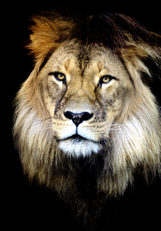
Helen Whitford_King of Beasts
Helen – our MC for the night – then showed us how she made King of Beasts (that great lion image) – starting with the lion with the cage behind it – in all its distracting glory. However, using Nikon Capture she demonstrated the removal of that grid, the ultimate vignette, and then the trick that Nikon Capture (which is apparently based on Nik Efex) allows modification of colour range brightness and contrast at an extreme (almost pixel) level. This allowed her to alter fur, reflections and edges with extreme accuracy.
Richard Akroyd then followed up Helen’s demonstration with more about Nikon Capture showing the broad range of what Capture (ie Nik Efex) can do. Could well be worth the $149!
To follow the high tech world of fine level manipulation, Mark Pedlar presented the image manipulation tech of Photoshop layers and the right selection of images. His Hell’s Gate image is a photo that’s been 7 years in the making when he first saw the gate. Assorted attempts at making it look good were not 100% successful. However, with perseverance we can now show how he did it:
So there you have a summary of the nights proceedings. Lots of lessons and methods, but not all of them high tech. In fact, some really simple techniques that result in some of our presenters gaining the highest awards in the amateur photographic world. As Jo said, sometimes all you need to do is play with the tools you have and learn what they do to get the most out of them. Sage advice
Chris 😉
Les Peters: The Bird Man of Aldgate – 22-May-2014
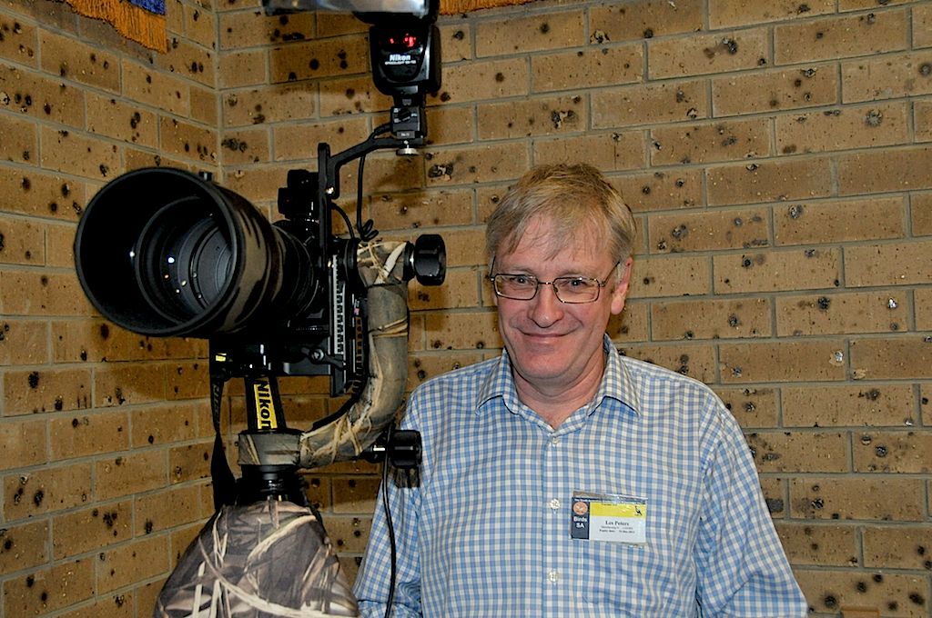
Les Peters at BPC on 22-May-2014 with part of his bird photography set up
On the 22nd May I had the pleasure of introducing Les Peters as guest speaker to the Blackwod Camera club. Les is a keen bird photographer living not far from me in the Adelaide Hills. I became aware of Les’s photography when he gave a similar talk to the Birds SA group some 18 months ago. Speaking to him after this meeting, he encouraged me to step up from the small Panasonic I was using and buy a Nikon. As it happens I did buy a Nikon and within weeks he was loaning me his Nikkor 300mm lens. Les took me out to some of his haunts, Laratinga wetland and Browns road reserve. I was fascinated by his depth of bird knowledge which is equally matched by his knack for photography.
His presentation was no less intriguing, saturated with his passion for bird photography. He talked almost without interruption for 90 minutes and showed over 200 excellent bird photographs (a small selection is in the slide show below). It is hard to comprehend the range and quality of the photos when they come so quickly and intensly. Les however chatted away, keen to tell the story of each photo. The birds, as Les describes them, have purpose and personality. This youngsters learning to fly, this one is making a nest, this one hiding from the camera, this one thought I couldn’t see it. Some of the birds were common, yet beautifully captured. Others were uncommon or rare birds and would take great luck and skill to capture.
As he talked he described his techniques. Sometimes he will stalk the bird with the camera in hand. However his preferred technique is to sit and wait for the bird to acclimatise to his presence and photograph them as they relax and begin to behave more naturally. He said it often takes around 20 minutes. Les often uses a tripod and a flash with a “better beamer”. Certainly these shots had much stronger detail than the ones he took by hand. The sharpness and detail of his shots was breath taking. Occasionally he would enlarge a shot 3 or 4 times and I admit I could not see any less detail in the cropped image. He also described how he photographed birds by remote control.
It was a packed house with over 40 in attendance. Talking to various people after the meeting, Helen and Jo said they felt inspired, and were looking for an opportunity to hone their skills. Jo was impressed by Les’s kit. “That Gimbal head on the tripod is worth a heap.” Ashley although admitting that Bird Photography was not his thing, learnt much from the evening, especially from the explanation of the techniques. He was amazed that it only took 20 minutes to familiarise yourself to the birds. Richard found useful Les’s advice to get to know the behaviour of the birds in order to take better photos of them. Ray lamented that there were too many images that he wished he had taken. “There is one common theme though. The best images are taken closer to the subject. Even if you use a long telephoto lens a small bird is still a small bird and you can’t fill the frame even with a 1,000mm lens.”
Les’ hints for success
|
I’d like to thank Les for taking the time to share his remarkable hobby and passion with us. In the car on the way home he agreed to lead an excursion to the Laratinga Wetlands later in the year. I will speak to Graham and finalise details later. I can personally say it is worth going out into the field with Les.
James Allan
The April 2013 CameraClips – revisiting the judging discussion
The latest edition of Camera Clips was sent out to club members today by James. Once again, a good selection of interesting articles from club members – well done James for putting together a collection of really useful articles on composition.
Two articles really caught my eye about that hoary old chestnut – photographic judging. Many of you know what I think about it, and to be fair, SAPF President Alberto Guirelli is working with the SAPF committee to change the culture. However, the following articles from James Allan and Mark Pedlar will make you think some more and refresh the discussion.
Learning a better way to Look at Photographs
Ascribing Merit – James Allan
I have learnt a lot from attending Photo club competitions. There seems to be a set of rules that will help you to do well. To name a few things, I have learned that:
- The Horizon should always be straight
- We should see the front of the person not their back, and preferably they should be looking at the camera to engage the viewer
- A moving subject should move from left to right and that
- There should be space in front in order for them to move into
- The subject should be offset onto the thirds
- You should not cut off the top of the persons head, (or their feet)
- It should be sharp throughout
- You should not have burnt out highlights – and no bright spots on the edge of the picture
- You should not depict 2 or 4 subjects, in fact any even number – or any number over 10
These statements appear to be emphatic and should not be broken. In fact I have been told that it is OK for me to alter my image with Photoshop if it means that I can eliminate one of these faults from my image.
NOTE: All images below are the copyright of the original author and only reproduced to demonstrate the authors points about judging
 Now have a look at this monochrome portrait. This picture was entered into an International Photo Competition with National Geographic magazine. It has flat lighting with little modelling of the features. The top of the head is chopped off. The corners of the image have a harsh distracting vignette. The model is looking level and straight into the lens without emotion or gesture. She could have been instructed to look more appealing in this stark picture. Technically it could have been done in a photo booth. It won the people’s choice award.
This is what the judges wrote about this image.
This enigmatic shot is “timeless—it has a beautiful simplicity with no pretense,” says Monica Corcoran, senior photo producer at National Geographic Digital Media. “I keep looking at the portrait and wondering about this woman,” says freelance photojournalist Tyrone Turner. For National Geographic magazine senior photo editor Susan Welchman, “the ambiguous, mysterious style also frees the viewer from knowing when or what time period it was shot. Or is it a painting? All unknowns release the viewer from facts and encourage interpretation.”
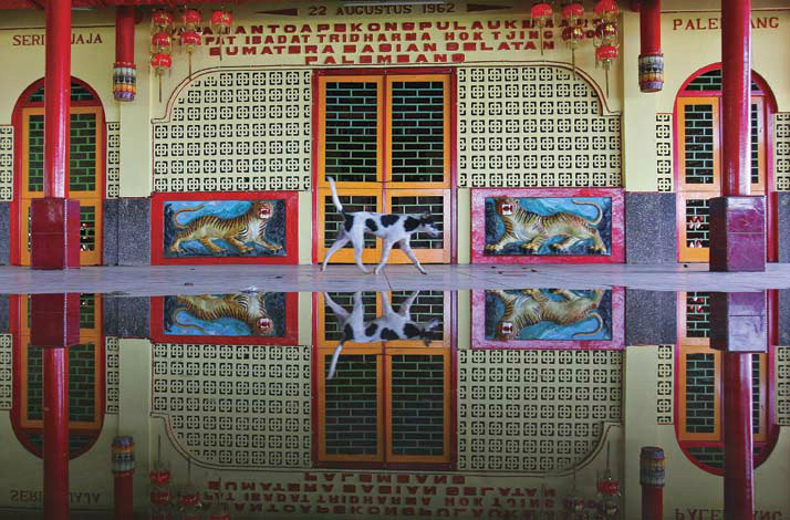 Or look at this photograph of a dog which was also entered into the same competition. The dog is dead centre in this picture. It is lost in the pattern of the façade and does not stand out at all. There is a near perfect reflection of the scene which competes for the eye of the viewer. One is confused as to whether to look up or look down. Perhaps the photographer should have cropped either the scene or the reflection to reduce ambiguity and give a greater sense of balance or harmony. In this case the picture was awarded an honourable mention.
This is what the judge had to say for the picture:
At Hok Tjing Bio, a Chinese Temple in Palembang South Sumatra, Indonesia, the photographer has framed the shot at a precise moment, with the reflection, and the position of the passing dog in the middle of the tiger pictorial on the temple’s wall.
Despite all that I have learned about breaking up symmetry, this judge applauds the effort to portray and reinforce the symmetry of this image.
 Or how about this picture of some Cuban kids letting off fireworks. The horizon is not straight. The characters are moving out of the frame of the picture without there being room for them to move into. Two of the figures have been amputated by the frame of the picture. The largest of the three figures is entirely blurred. It however also received an honourable mention.
The caption reads, The picture was shot at San Juan de los Remedios, Cuba, during a local celebration called “Las Parrandas” in which the highlight is fireworks. Here children light the fireworks and escape.
 Lastly this image of a fair ground. Again the horizon is crooked, the main subject, the carousel is entirely blurred. There is a very bright highlight in the sun competing for attention with the subject. This one however was the winner of this section of the competition.
And the Judges’ comments:
The transporting quality of this photo “conjures up childhood,” says National Geographic senior photo editor Elizabeth Krist. Adds freelance photojournalist Maggie Steber: “The photographer took something we have seen a lot and managed to frame it in a setting that is unexpected. It is very cinematic and creates a scene and an opening. What will happen next?”
What I have learned at photo club seems to be at odds with the way the National Geographic judges have been assessing their images. What were the judges thinking of? Haven’t they heard of the rules of composition? Didn’t they attend a photo club? What is going on?
There seems to be a difference in the way we are looking at the images. My initial comments for each image are based on a set of empiric rules. They have been told to me week after week as I attend the various competitions. The National Geographic judges however allude to their emotional reactions to the image. They seem unperturbed by the transgression of the rules, as long as the picture finds a resonance, or emotional quality. As Mark Pedlar puts it – the image has impact.
I am reminded by Arthur Farmer, a life member of our club who loved to quote Ansell Adams – “There are no rules for good photographs, there are only good photographs.”
Perhaps we should not think of these photo club statements as emphatic rules, but as techniques of composition. Let me give an analogy. Although a polarising filter has a pleasing effect it is not mandatory that you should always use one in every photograph. Sometimes the polariser can really look awful.
Likewise there is no rule that says that your horizon must always be straight. In the 2 photographs above the uneven horizon creates a sense of movement and drama in the picture. In each case a straight horizon would ruin the effect. Conversely, the horizon is better straight when you intend a sense of balance or calm.
So how do the National Geographic judges ascribe merit if there are no rules? This is perhaps the easiest and hardest part to grasp. It seems they ascribe merit by their emotional response. That seems arbitrary and subjective. Not so. The photographer has a vision they wish to convey. The good images are more successful in swaying the opinion of the judge, better at showing that vision. In fact the set of compositional rules is more arbitrary as it instantly dismisses quite a large number of images. Images that may win International competitions, images that might thrill and excite us.
To sum up, I believe that we need to look at pictures differently. We need a different set of spectacles. It is not about adherence to a dozen rules or guiding principles. I think that is an old prescription that served us well when we were starting to learn the ropes of photography. Now it is time to take off that pair of glasses and look for that inner response that the image creates. What is the photographer’s vision and did they convey it well? We need to relook at the pictures with a better prescription, and I think we will begin to see things that we didn’t see before. I believe we will find more enjoyment in our photography.
James Allan
James top tips for creative composition
Don’t show the whole thing.
Leave the picture unfinished – let the viewer complete the story (in their head)
Isolate the essence.
Why did you like the scene? What is the essence? Isolate it. Leave out the rest – just photograph the key ingredient.
Don’t over indulge the subject.
Think of the subject/object as a spoilt child. Concentrate on the pattern, the colour, the texture, the subject will make its own way into the picture (don’t be obvious – be subtle)
Look for movement.
Movement engages. Freeze it or blur it – it doesn’t matter. Curves and diagonals create movement. Crooked horizons. The centre is balance, the edge is movement. Look for movement in the picture.
Do it again
Do it different. Nothing wrong with going back over old territory. Often the second time is better. (Don’t try to be better – just try to be different)
Follow the light.
It can transform the subject. Photograph where it shines, where it leads y our eye, where it casts a shadow. Keep walking around until the light lets you in.
Don’t over think.
The concept is usually wrong. Take what you see, not what you want to see.
Work with space.
What does this object need? A town house needs to be cramped. A manor house needs an estate around it. Try it different ways. The Japanese also look at the space between objects. Should objects be separate, should they touch or even overlap?
Do the unexpected.
It’s always better.
Mimicry is king.
Look at photos you like. Watch what others do. Suppress your instincts and do it their way . (It will never be their picture if you take it).
Don’t wait for perfection.
Take the shot anyway. Learn to tolerate blemishes. Mistakes can be miracles and save us from conformity.
Look for lines
Lines will connect objects and make them interact. There are real lines (eg fences) and interrupted lines (eg a row of soldiers) and imaginary lines (eg gaze of a person or direction of a car). Parallel lines are balanced, curved lines create movement and are dynamic, converging lines give depth, while crossed lines clash and create conflict. All are good.
10 Common Criticisms at Photoclub competitions
- The Horizon should always be straight
- We should see the front of the person not their back, and preferably they should be looking at the camera to engage the viewer
- A moving subject should move from left to right and that
- There should be space in front in order for them to move into
- The subject should be offset onto the thirds
- You should not cut off the top of the persons head, (nor their feet)
- It should be sharp throughout
- You should not have burnt out highlights – and no bright spots on the edge of the picture.
- You should not depict 2 or 4 subjects, in fact any even number – or any number over 10
- Symmetry does not make a good photograph. Try and unbalance or disrupt Symmetry (for instance reflections
A JUDGE’S PERSPECTIVE – Mark Pedlar
Over a quarter of a century as a camera club member in Adelaide I’ve had most of James’ ten points levelled at my images. The thing is that they all contain grains of truth. They simply aren’t and should never be used as rules.
Our word horizontal, meaning flat, takes its name from the horizon which we all assume to be level. If you are shooting traditional representative seascape you will probably have the greatest impact on your viewers if the horizon is flat. In James’ carousel image the tilted horizon adds to the impact. It is often the case that we find images with a subject offset from the centre more pleasing than those where the subject is dead central. We don’t need to go through all ten; the point is that all can be guides to beginners in photography when they are designing their images. Similarly, the ‘rules’ of composition are guides. You don’t necessarily need an ‘S’ shaped composition, or a triangular one. Diagonals can be pleasing. The point again is that these are guides.
I have talked at several camera clubs about IMPACT in images. In this I’ve used some of the images from Henri Cartier–Bresson world acclaimed as an outstanding photographer. In these many of the human subjects have limbs or parts of limbs amputated by the frame. Yet these are lauded as photographic high art. So the rules don’t always apply.
You should never be hide-bound by the rules but it helps to know the tips at the outset.
So, why do so many judges appear to place such importance on rules?
Tonight I’ll stand in front of 20 – 40 photographers in a suburban club and judge 100-120 of their images. I’ll judge each of the images out of 10 for their artistic merit. This merit will be a combination of MY OPINION of the composition, technical merit, subject material, lighting viewer impact etc. I shall also give a brief critique of each image. For those lower scoring images the objective is to provide a few tips for demonstrating greater artistic merit next time.
At this stage many judges tend to need to justify the score they are about to give. I am about to score 4 out of 10. The author deserves some reason why their image scored so low. It is easy then to fall back on James’ 10 points to show what was missing in that image. That sounds like a cop-out, it isn’t but it can happen.
The National Geographic judges were not required to give each author both a score and a critique of their image along with a similar critique of all the other entries. However, they did pick the best even though these broke the so called rules.
I believe the very system of club judging can mitigate in favour of the tendency to fall back on a formula. As a result club members become acclimatised to presenting images which follow the rules. Further, since judges are drawn in large part from long term club members they can bring with them the culture of these ‘rules’.
Look at the images produced by Uni SA undergraduate. They bear little resemblance to those seen in club competition. Many are far more adventurous.
More significantly, several club members took part in a 31 day challenge over the Christmas break. Some of these images were shown at the club’s first meeting of this year. Many were stunning! Several showed originality, excitement and adventure which doesn’t seem to re-surface in club competitions. We have a wealth of unobserved talent out there. Why is it we do not see some of these images in regular club competitions?
So, take photos for yourself not for a judge.
Keep the ten tips in the back of your mind, they can be helpful.
Whatever the judge says, theirs is only one person’s opinion.
Show the club your best work.
Mark Pedlar
There you have it – a very effective discussion about the difficulties of shooting for yourself and what the rest of the real world is doing.
As for those rules, to paraphrase a famous pirate movie – “the judges rules is more what you’d call ‘guidelines’ than actual rules”.
So go out, take photos, enjoy your passion, but don’t be limited by the amateur photography world and their judges.
Chris 😉
Ruminating on the peer review process
Its been an interesting time since we decided to implement the move from competition to peer review. Of course, these review nights have been a work in progress – rough around the edges, but slowly evolving into a night where club members can present an image and not be intimidated by a low score from a stranger. For newer club members, that’s even more important, and Ashley’s recent article in the SAPF Camera Club News (page 10 – One Easy Step) highlights the problems such a judge can cause for all of us.
The first question to ask is why do have peer review or even competitions? I suspect the answer lies somewhere between seeking praise from our peers and wanting to improve our skills.
Could it be that most photographers are all natural show offs? Its personally satisfying to share that little trick or image we’ve found and get a little praise. Its also the social aspect – like telling a story around a campfire and getting attention from your peers. It just makes you feel that little bit better. Regardless of the reason – constructive, positive comments work better than negative, destructive ones.
So here is a brief evaluation of the first half of the year and the peer review sessions (4 of them so far). I’ve included some images to entertain you too – examples of some of the experiments and images we’ve seen to date. See if you can work out what the photographer was playing at.
Firstly, there was the issue of how many images to display. We started out with rounds of prints then digitals – up to 3 rounds in all with 1 image per photographer in a round. To say I was a bit overwhelmed by the response on the night is an understatement. We had a lot of images! So refinement one will probably be that we go back a bit and have 2 rounds, but still with one image.
Secondly how to present the image. The photographer had to describe what they were trying to achieve. Timing could be an issue here – so we gave the photographer 1 minute to describe the image and what they were trying to do. The problem is that people find it hard to say that in 1 minute. Which statement helps the panel more? “I saw these brilliant flowers and took a photo” or “I saw these brilliant flowers in the foreground of this otherwise drab landscape and tried to show the contrast. Does this image work or can you suggest how to make it better?” Do you get the key words? “tried to show” “make it better“. That’s what we need to help the discussion along, otherwise the panel has to fish for an idea to help the photographer.
Thirdly, getting feedback. The panel – followed by the audience – would discuss the image, and the two panelists 1 minute, then the audience could have a go for up to 3 minutes. The problem? You can’t stop people talking. That’s both a good and bad thing.
Well at our first attempt, it its generated a lot of interest with people from other clubs attending the review nights to see how they work. It was a bit rough, and we ran over time. So what? We at least had some fun. We wound up looking at everyone’s first round of images, and then rushing through the last ones. Lesson learnt – keep to time and don’t over do it.
The second observation was that the panel tried to help by saying “a judge would say……but I think…..“. There you go – judges again! Seriously, if we are going to get out of the standard photography club rut we need to discard what the judge says and move to what we feel and think. Don’t worry as much about the technical as the art. We can all improve the technical with practice, but the art comes from the photographers mind. The photographers thoughts are paramount. Everyone else is viewing what goes on in your mind.
That brings me to the third observation – telling the audience what the photographer is trying to achieve. For any review night, we need to help the panel formulate their thoughts. So we’ve encouraged exhibitors to say what they are trying to do, and how the panel & club can help. Not always successful – but I think we are starting to get there.
The next thing is number of images and timing. Two rounds seems to be enough, and timing, although important, is not paramount. Let the photographer have their say. Let the panel mull over the image. Let the audience chip in with comments. Its a conversation as much as a critique session. The only limit is really the imagination of the presenter and their peers.
When we first proposed this concept of peer review (and its not a new one) I was surprised by a number of contacts from outside the club asking if they could come along. My natural answer was “Yes – we’d love to have external input into our little experiment.” But maybe that’s the sort of club we are – outside the main stream and a little bit “bolshy“. It led to some interesting email discussions too – which were very stimulating intellectually and led to a lot more thought about the process we had begun.
What I have seen evolve over the last few months is less of the what the judge says (or would say) and more of the “I like it. I wouldn’t change it at all. I love the way you…….” or “Its pretty good, but I think if you cropped/reframed/coloured/desaturated/changed aperture/shifted shutter speed/removed noise (etc etc) in this it would work a little better“. The result – we’ve had members bring back their images after a suggestion and see if it worked better. We’ve had images entered in competition (or not). They are not all main stream photo club images either – that’s a nice change!
The other thing I’ve noticed is that unlike competition nights, the audience doesn’t fall asleep – the conversation keeps going. There is rarely silence (some folk can’t keep quiet). Everyone gets involved. I’d call that sort of engagement success. And importantly, you don’t see the muttering around the room afterwards about judges with no idea what they’re talking about.
So in conclusion, how is the experiment going? I’d say fairly well. Its not perfect, its evolving as I said at the start. We will get better. Importantly its a conversation between people in a club that shares a passion. Isn’t that what the club is supposed to be about? If it produces better images that a judge likes then that’s a bonus – but I’m personally pleased that’s not the aim.
Chris 😉
28-Mar-2013 – BPC Presents photojournalist Barry O’Brien sharing his experience

Who wants to be a critic?
Record the date 31-Jan-2013 as an important date in your records.
On that day Blackwood Photographic Club embarked on a new direction that encourages more participation and sharing of photographic ideas. We moved from the mainstream camera club ethos of competition and into (what for us in 2013 is a new idea) actively sharing, encouraging and improving our photographic art as a group, as well as learning from each other and not just receiving a judges opinion.
Interestingly, the peer review/critique session is not a new phenomenon. Many educational institutions have done the same thing for decades (if not centuries) – the arts & literature need feedback to develop. The early days of our club embraced this method of learning, but it got lost along the way. Well, I think we’ve found it!
The night began with another significant event – the raising of the new projector screen!
Matt, Ashley & I spent a bit of time planning how best to mount the new screen – and after a bit of brainstorming, came up with the solution of clamping the screen to the ballet rail and raising the screen up. We did a test run on the Australia Day long weekend, and with a little paint, some more brainstorming, a ladder, some hand tools and a drill the new screen was ready. This method overcomes the problem of the mass of the screen, and therefore reduces the risk to the people raising it as well. We’ve employed the old widowmaker rods for raising it, but they’ll soon be replaced with something even better.
The big advantage of this screen is that we can now project our images at full 4:3 (just like your camera) on a larger, brighter screen. We must acknowledge the support of the SAPF in partially funding the new screen – which replaces our 30 year old screen.
The night was also significant for the debut of the new print stand. Eric built a new one just before the end of last year which is more robust, and allows prints to stand in a rail rather than be clipped into place. Even panoramas will now fit. Our sincere thanks to Eric for his efforts.
So on this already auspicious evening, we began our critique session. It was a pretty full house with many club members present & displaying their images, as well as 5 new members (welcome to Lesley, Ren, Grant, Gerry and Ron). We also had a few visitors – Peter & Richard from Edwardstown PC, Rosemary & Roger (2nd time – I remember 😉 ). Richard & I have corresponded about this new direction a few times as well – illustrating that our ideas find a resonance outside the club. We were also pleased to see life member Ruth Palmer attend and lend her support.
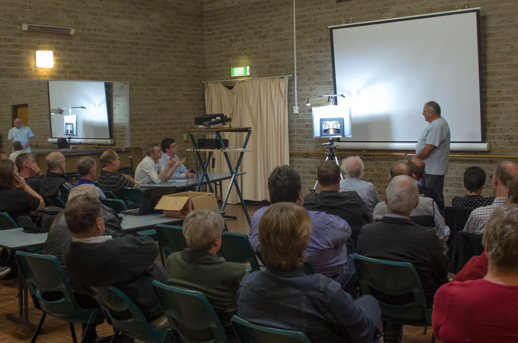 Critique using the new print stand too |
Our inaugural critique night (the modern edition) comprised Matt & Ashley as the review panel, with myself as chairperson, and images (print, slide & digital) from 18 club members. Not bad for a first draft. The initial concept was to have the images displayed in rounds of 1 image (or set) at a time. We thought that up to 3 rounds could be had in the normal meeting time. Each member was allowed up to 1 minute to describe their image, then the panel discussed the image, followed by comments from those present for a total of about 5 minutes. This worked reasonably well, except that the panel and audience ran overtime – repeatedly! That will have to be tightened up! |
A few observations about the process I mulled over afterwards:
- Some members put up images and basically said “What to do you think?”. In retrospect it should be “I was trying to achieve …… by doing …… – have I achieve it or how can I get there?”.
The critique this type of opening remark received was at times a little soft, but then the introduction by the photographer led to that. So next time you come along please tell us what your trying to do - Matt & Ashley tried to be constructive and make helpful observations. They prefaced some remarks with “a judge might say…..”.
Although this is valuable, particularly for competition, its not the only way to provide feedback, and they tried to avoid the cliches. Well done guys. - They also worked hard to give feedback on composition and technique – along with members of the audience such as Arthur (who I think commented on every image), Eric, Helen, Ray, James & Peter (apologies to those I missed).
Many other members chipped in too – and this is the important part of the night – we all took part.
I felt all those present were looking and trying to help the photographer improve the image – and not just superficially. This is something we miss after a competition night as the images get whipped down and stored. - Everyone stayed polite and constructive – brilliant!
- Members such as Helen, Heather, Theo & Eric displayed images to help them refine their display and technique. Helen addressed her ongoing screen calibration issue, Heather looked at image resolution, Eric showed us how to photograph drops of water & Theo addressed the issue of what is the best perspective – in close or out wide? All of this generated some excellent discussion in the process – and many of us – not just the authors – left with new insights.
- There was a good selection of prints on the night as well – with some valuable discussion on breaking the standard judging rules – the rule of thirds needs to be taken out and buried and sharpness need not dominate our lives!
- We ran out of time after the first round – hmmmm. Fortunately, we managed to have a 15 minute free for all with the remaining digital images.
Next time we will have to be a lot stricter on time limits - We were all enjoying it so much I didn’t see anyone doze off. Amazing! Some competition nights you can almost here the snoring – none evident on this occasion! 😀
Next time we’ll have another pair of panelists – everyone will get a turn (don’t be shy!). In fact thats another way of improving your art – by being made to give feedback to someone else.
So there you have it – the first installment of BPC Peer review. We’ll refine things as we go along. If you’ve got any ideas or observations I haven’t addressed email me or leave a comment on this page. I promise our critique nights will only get better!
Chris 😉
Next year……interesting times ahead!
In case you’ve missed out on the news most of the 2012 committee is back! But with some new ideas!
Our sincere thanks to Jenny Pedlar for her work as Treasurer over the last few years – but as we knew, Jenny wanted to pass on that role, and so we welcome Carolyn Beckett as Treasurer. We also have Helen Whitford joining as a general committee member to boost our numbers and give a fresh perspective.
We also have a some new positions – an Outings Secretary which James Allan has consented to fill. James will endeavour to have an outing a month for club members to both provide a social focus and get more images in our catalogues. Mark Pedlar has agreed to co-ordinate the judges, and Julie Goulter is reprising her role as Social Secretary! In fact Julie has already earned our sincere thanks for organising the brilliant October Long Weekend outing at Robe. I’ve posted her report, but am still waiting on more images (although there are quite a few on Flickr)
On to the new exciting stuff.
At this years AGM, we had a discussion about the direction the club was heading in. I have had comments from members about judging, workshops and getting more out of the club. In my opinion we were in a rut, with the regular cycle of workshops/talks (which are generally very good – who can forget Stavros Pippos!) and competitions (which can range from good to downright awful depending on the judge and their comments). In fact, after one competition I had several members leave in total exasperation and frustration that they had learned nothing new and sat there listenning to one persons “egotistical rant”. That was followed up by several phone calls expressing their concerns.
We have all felt frustrated with judges in the past – including me. But it then begs the questions What is a photography club? Is it
- a social gathering of like minded people?
- a place to have some fun?
- there to help people improve their photographic skills?
- there to provide constructive critique of photographs?
- meant to be a discussion forum?
- there to help us push the boundaries of our photography?
- a place to learn about new directions in photography?
- there to provide a competition venue?
The answer is Yes to most of these questions, but one question should not dominate the others. Unfortunately, the last question – is it a competition venue? seems to have started to dominate our club. Thats not why I joined, and from what I’ve heard from many others its not the reason they joined either.
So how can we bring it back to the core values of enjoying and learning new photographic skills with a bunch of like minded people? To start with, how about having more outings and doing things together? Well, the Outings secretary and the Social secretary can address that. So theres a tick in that box.
What about learning new things? The workshops (both member and external visitor supported) address aspects that cover that. So another tick (although we need to know what you want too! Please tell us!).
Then the question of discussion and constructive critique arises. Now we have a problem. We can listen to judges comments at competition nights, but its not a discussion – its a lecture! Some are better at this and some are worse – more of the latter rather than the former in my experience. After a lot of thought and discussion with the committee, we thought it important that we give our members the opportunity to talk about their images and get constructive feedback. That gives us context. More importantly, it reintroduces dialogue – not just throw the image up, get it judged, put it away and say goodnight.
As a result, at the AGM, we put up a new proposal (I’ve put that in a PDF you can download and read) – to switch meetings to a rotation of 1. Workshop/Talk, 2. Competition and 3. Critique night. After some discussion, the proposal was passed almost unanimously! Now we have a chance to worry about competition less, and instead think about photography and push the boundaries of our skills. There will still be competitions (7 instead of 10), but there is now a real opportunity to have dialogue and share our thoughts. So now we have tick for that box as well.
So starting next year, there is a new programme (coming soon in the RSS feed) that encourages club members to share their images and talk about them. Don’t be shy – bring in your images, have a talk about it, listen to what others have to say about them.
This change will also introduce our new projector screen – which now has a 4:3 aspect ratio (ie bigger images) and is more reflective. We were fortunate to secure a partial grant from the SAPF (after some discussion) to help us replace our 30 year old projector screen. This week, Ashley & I collected the screen, and Matt & I spent Friday night planning how to mount it on the wall safely (the widow maker won’t do!) and store it. It will involve a bit of engineering, but we have a plan and should have it up for the start of next year! Thanks to the SAPF and the committee for helping to get this important piece of equipment replaced.
Speaking of the SAPF, I must mention the new direction they are taking thanks to SAPF President Alberto Guirelli and the new committee. Alberto spoke to us after John Hodgson’s AV presentation earlier this year. He came not only to speak, but to listen to what clubs want from SAPF. As he pointed out, SAPF is there to represent us and bring us together as a community. As you all know, Alberto is a fan of our little club and its attitude (a favourite of his is our little blog entry about judging for example). To bring about this change, he is actively seeking opinions from clubs, trying to get greater involvment from the clubs with the community, change the judging process (he has joined the pool of judges), and is trying to engender a change in attitude to bring modern ideas of photography into the process of judging and photography. That includes discussions with the AIPP about judging and a national standard, increasing the range of images we and the judges see and more focus on the art (and impact) rather than the technical aspects of photography. We can help by joining with SAPF in pushing the boundaries of judging, and criticising them if they don’t meet the standards we want – so we need to ensure we submit judges critiques to Keith Siedel and the SAPF judging team. Alberto reminded us of the mantra that many of you have heard from me – shoot for yourself! Please support Alberto and his cause – I feel that he is bringing back relevance to the SAPF and that has to be a good thing for all of us.
The final thing I’d like to mention is the new Australiana Landscape Trophy in the Annual Exhibition which is being sponsored by Ursula and Theo Prucha. Many thanks to the Prucha’s for sponsoring this award and giving us something new to try and achieve. I’ve put the description of the trophy and its rules into the Awards page and the Annual Exhibition entry form.
Another of the changes we have planned for the Annual Exhibition next year is that we are going back to tradition and not going to have you all sit through 2 hours of silence whilst the judges look at images! We’ll have the judging outside of club hours with just the committee and then have the Annual Exhibition with everyone seeing the images for the first time and awards handed out so we can have a decent discussion about the assembled images!
Enough of El Presidente’s thoughts – see you all soon at the Annual Exhibition judging (bring the NoDoze :D)
Chris 😉
Print making – a couple of professionals share their knowledge – 5-Jul-2012
Some of you may recall the comments last year from guest judge Lindsay Poland on the quality of printing in one of our competitions – and it wasn’t all favourable. So to help us improve things, we invited Lindsay back to talk about making prints. Lindsay is also friends with Steve Huddy from Canon, and managed to get Steve to come along too and share his knowledge of inkjet printing.
To start proceedings, Steve told us little about himself and the history of inkjets. Steve was once a professional photographer who cruised on Fairstar liners – and he shot Nikon (not Canon) for a long time. In those days it was all film. When the first good quality, manageable digital cameras appeared, like the Nikon D1 (the same as Eric showed us a few weeks ago) it was a revelation. At some stage, Steve switched brands – but that’s another story.
Of course, once you have digital imaging, you need to print the images. You can of course use professional labs (like I do), but you can also print at home (like a lot of you do!). Enter the inkjet printer!
There is also a story that Steve told us about technician who accidentally put his fountain pen on a hot soldering iron. He didn’t realise his error, but a few minutes later ink squirted out of the pen, and the inkjet printer was born. In fact, story of the inkjets dates further back to around 1867 when Lord Kelvin patented a continuous (pumped) ink stream method directed by an electrostatic charge to mark products (didn’t know that did you?). But the first commercial version didn’t appear until 1951 and was mainly used in chart recorders. An IBM inspired idea was contracted out to InkTronic (according to one blog I read), which developed this further in the mid 1970s creating a matrix type printing system, but the quality of the printing wasn’t great. Other inkjet systems developed soon after using different methods – heating the ink through a matrix of small heated nozzles which bubble out the ink (think Canon, HP & Lexmark/IBM) and piezoelectric head which changes shape when a charge is applied and ejects ink. from (think Epson & Brother). Incidentally, there are also thermal wax “inks” that work a bit like a laser printer and don’t run when they get wet (mainly Fuji-Xerox) – but these aren’t aimed at the home printer. There’s a Wikipaedia article on inkjets if your interested in more detail – and a stack of other material you can find with an internet search.
The inks that are used vary as well – either pigment inks which are particles that sit on the surface of the paper or dye inks which soak into the paper. Pigment inks are ideal for B&W images. We worry about the longevity of the these inks compared to silver halides and manufacturers now quote a 300 year life span (under glass and on a wall) but only 100 years if exposed to air and light – a long way from the inkjets of old. This improvement in ink quality has led to many professional photographers now using inkjet printers for both proofing and display. For example, internationally famous wedding photographer Yervant (who recently gave some talks in Adelaide – and 5 BPC members attended) now uses inkjets. Part of the reason is that he perceived that 30% of the work is taking the photo, 20% is marketing, but 50% is the post production work which the photographer must do to realise their vision. Another example is Adelaide born photographer Robert McFarlane, who recently at recent retrospective display of his work at the (the Art Gallery of South Australia also have a permanent collection of his work as well) showed inkjet printed works – and is reported to have saved over $2500 compared to conventional prints.
To demonstrate the current generation of inkjets, Steve brought along a Canon Pixma Pro9500 Mk II printer – capable of printing on A3 using 10 colour ink cartridges using 6400 jets. This class of printer has a price tag to match though (over $800) plus inks (about $350 for a set of cartridges) – but has been superseded by a newer model that retails for about $1500. He also printed two A3 size images – one full colour and one in monochrome. If anyone is interested we have the images in our store cupboard (will they last 300 years in there? :lol:).
The important thing to note about using inkjet printers (and papers) is that they must be colour profiled along with the screen. Some large printing houses (such as Atkins) can provide the colour profile of their printing equipment to allow correct colour matching.
The question was asked of Steve – why are printer inks so expensive? The answer is that the printers are almost given away, and the cost recouped with the ink cartridge. The manufacturers of course don’t want you to use third-party inks, as they are not reverse engineered versions of the original inks, and are claimed to clog heads etc. I won’t get into that argument, but if your going to produce inkjet prints for competition or display use the best materials you can. Fortunately the ink wars don’t apply to printer paper, printer manufacturers now allow multiple papers profiles to be used from any manufacturer.
Lindsay then took up the conversation, talking about his own workflow. He has 22 years experience in the printing in the wetlab – and more recently the digital world. The difference as he points out is convenience vs control. Wetlab printing uses an sRGB colour space (see Jame’s Camera Clips for December 2010, February 2011 & September 2011 and for a discussion about this) with an array of 3 LEDs and any corrections are fairly basic – most must be done before the printing stage. Inkjet printers in contrast allow finer control – like a wetlab but still in an sRGB colour space (for reference, there is also Adobe RGB colour space – that’s used by offset printers that use CMYK). sRGB is adequate for most printing needs, and covers most colours we can perceive.
When we print in black and white, there may be a colour cast. This is a result of either the printer generating the black from mixing colours or a cast applied in post-processing. Better quality inkjet printers overcome some of this by having different shades of grey – not just black ink. The important part – again – is to profile the printer correctly and convert the image to grey scale.
The important part of that workflow is making sure his monitor and printer are calibrated correctly. For that he uses a spectrometer from ColorMunki from X-rite which allows him to calibrate the screen and importantly, the printer as well – a 30-45 minute process in total. Fortunately, the paper and printer only need calibration once, but the monitor is regularly checked (for those that aren’t aware, we have a Spyder 3 Pro spectrometer which allows us to calibrate screens only – club members may hire it for $10 + $10 bond).
Like the inkjet printers, papers also have calibration requirements. The International Colour Consortium (ICC) have a profile for each paper which may be downloaded from the manufacturer website. Lindsay uses Ilford Galerie papers – including a wonderful new 310gsm paper that’s like traditional baryta (barium sulphate) photographic paper that allows a high colour gamut – Galerie Prestige Gold fibre silk 310gsm
Once calibrated, the workflow can begin. Lindsay uses Adobe Lightroom where he will check & adjust exposure and sharpness. A useful tool available in Lightroom 4 is soft proofing. This allows you to check how the final image will look on paper before printing (and so save money) – but it only works if the screen is correctly calibrated.
When printing, a couple of tips from the professionals we gleaned:
- Don’t print at High Quality – it will just use more ink and you’ll get nothing extra. Just use standard or normal
- Allow the prints to dry to get full colour saturation – it can take a few minutes
- print at 360dpi – that’s more than adequate
- streaking on your prints is probably a result of dirty print heads – clean or replace them
So there you have it – words of wisdom about printing images to the highest quality. And I think the take home message is calibration!
Cheers
Chris 😉
Aesthetic Choices – a readers survey
I have often noticed that people will have a range of aesthetic values that they apply when judging the quality of their images. If an image is lacking in one quality, say sharpness, often it may still be acceptable if it is strong in other qualities, like colour saturation or a sense of movement. This summing up of an image is an intuitive process and can be understood as the impact of an image. Of course there is a wide range of individual tastes. However it surprising how a large group of people will often choose the same images, albeit for different reasons.
With this in mind I am interested to discover what aesthetic values guide our choices. It is quite obvious that there is considerable discussion after our competitions and dissent from the choices of the judges. Sometimes this is merely the frustration of not achieving the scores that we feel reflects the merit of our own works. Some of it could be a schism between the values of the members and the judges. Whatever the case, it would be nice to understand what aspects of our photos we rate most highly.
I am interested to do a survey of the club members – which has also been published in Camera Clips for September. However, for those of you with an online mentality, you can also do it here.
I have listed 10 different criteria or values that can be applied to a photograph. All I ask is that you number the list from 1 to 10 in order of how important you consider each of the criteria. Also I would like you to add one criteria to the list.
Click this link to start the survey…..(you have until midnight on 31-Oct-2011 to complete it)
I hope to publish the results in future editions of Camera clips, so that you can see how your choice compare with that of your peers.
James Allan
Abstract – 18-Aug-2011
| A good roll-up of members attended the competition on Thursday night 18th August. The set subject matter was “Abstract”, and many members submitted set-subject entries. Judge for the evening was David Smith, an experienced and successful landscape photographer with many photographic awards and honours under his belt.
It would be fair to say the subject matter created some interpretation problems for both entrant members and the judge. How should “abstract” be judged? If it’s an abstract, well, it’s an abstract, so it’s then possible to claim that any image that successfully fell into the category would be worth 10 points as it has succeeded in being an abstraction. Here’s some definitions: “Separated from matter, practice or particular examples; not concrete; ideal, not practical; abstruse; .. the ideal or theoretical way of regarding things.” (The Concise Oxford Dictionary of Current English, 5th Edition 1966) “1. conceived apart from matter and from special cases 2. theoretical; not applied 3. of or pertaining to abstract art.. etc.” also “Abstract Art: a 20th century concept of art which rejects the function of art as portraying perceived reality; non-representational art.” (The Maquarie Concise Dictionary 2nd Edition 1995) Our own definition was: So, with expectations the judge is to award more points to images he/she interprets as “better” abstracts than others (otherwise no point to having a competition), some “normal” photograph elements could then apply to differentiate between images falling within the interpretation. Impact was certainly one of the elements used, presentation (print matt boards and digital projection borders) was another, and also composition. The result? Well, you can’t please everyone and David conducted his judging in accordance with his interpretation. This may not have pleased everyone, but in the final analysis judging was conducted expeditiously and members like myself were grateful for this. Judging which drags on creates boredom and David certainly kept the pace rolling. I feel that, if the club includes “Abstract” as a future set subject (and why not!), we should ensure the judge is well-instructed about the subject matter when first engaged to judge. As always, I feel any subject which puts members (and judges) outside their “comfort zone” is conducive to expanding our knowledge of photography as a fine art. Ray Goulter The Abstract competition digital high scorers are on the Digital Entries page – along with a collection of Editor’s Choices. Two of my favourites prints from the night are featured here. Chris 🙄 |
 |
 |
Just some thoughts on Photo judging that I penned after the last meeting
The following is from an email discussion James Allan started earlier this week. With his permission, I’ve included the email and appended the initial reply (from me). James certainly started a lively discussion in the club! I’ll post the other replies as other authors give their approval for posting here.
Chris
Why don’t they paint great pictures any more? I contend that the artists are intimidated. It’s because photography is now the superior artistic medium. The great artists can no longer compete with the skill and sophistication of modern photographers. Let me illustrate the point. I will take a random selection of famous paintings from the worlds galleries and give you an example of the kind of flack (the yellow text) they would attract at the humblest of camera clubs.
Take this Boticelli for instance:
 by Alessandro Botticelli")
Certainly a good attempt at a group interacting at the seaside, however there are a few pointers for some one new to photography. My eye is travelling hither and thither trying to find somewhere to rest. There are 4 characters all looking in different directions and none of them seems to be interacting very convincingly. Surely it would have been easy to get them all to huddle together, give that girl a towel, and get them to look in the same direction. Perhaps it might have worked better had you taken a different vantage point, perhaps from the shoreline so that you could get rid of the distracting element of those trees. Now I must say that the lighting is very flat. You should have arranged this scene in the early morning or evening. As I said a good attempt, perhaps a bit busy, but I would have given this 9 points had it not been for that horizon. It’s 1.3 degrees off horizontal, so that’s what I’ll give it 1.3 points.
Now lets look at the picture by Paul Cèzanne:

I must congratulate the artist on the use of the rule of thirds. The building is nicely placed on the thirds. However I am very concerned by the overall softness of the image. Really a landscape painter should be able to do better than this. I really can’t see what the artist is focussing on at all. There is a strong diagonal distortion of the highlights that makes me wonder if there was some blurring due to movement. Perhaps the artist should have used a tripod and taken more time taking the picture. I also note that the contrast is quite stilted. If you play around with curves you should be able to adjust the image so that you get a good dynamic range with dark textural blacks and brilliant whites. Lastly and most importantly there is a pervasive colour cast to the image. It looks like the artist has spent too long inside under an incandescent light and now that he is outdoors he has the wrong white balance. Everything is bluey green. Again you can correct this in curves. Really it’s worth the effort, you will see the full depth of colour return to your work and you will be much happier with the result. I will give this one 5.
And this Renoir:
") |
A lovely pose with the two dancing in a crowded village space. You have captured a nice intimacy between the two characters. It’s a pity that you spoilt it all with your treatment. You have cropped in too closely to the pair. You should leave a little space from them to move into. I can understand that in a crowded situation like this you probablly had a lot of competing details to crop out, but I can’t see why instead you don’t just clone them out and retain that sense of balance in the image. The couple are dead centre and again I would have liked to see them a little offset, perhaps on the thirds. However the greatest probelm with this image is that you have turned up the saturation far too high. This picture is positively garish and for that I will subtract points. 3. |
And this Van Gogh

It is always difficult managing to deal with interiors. This is a good record shot of where you slept on your holiday to Arles, but I can’t see that it’s much more than that. The lighting is flat. I can’t see any shadows or comtouring. My guess is that you used the on camera flash, either that or it has been heavily procesed with HDR. You have made an attempt to correct some of the deficiencies in this picture in the post processing. Again the saturation has been over emphasized and there is this dark halo around most of the edges which suggests to me that you have oversharpened the image. Really it hasn’t had the desired effect. There is no more detail in the picture, just all of this extra noise. I think it would be better if you spent a little more time with the camera and less in the darkroom. Use natural lighting. You may have to bracket a bit to find the correct exposure. Show the light from the window streaming across that floor. Let the corners of the room remain dark. Use a tripod. An heroic attempt to rescue a mediocre image, 5.
Lastly lets have a look at a Turner:

I am having a lot of difficulty with this image. I’m struggling to find anything positive to say about it. It’s out of focus, all of the detail has been washed out, it’s over exposed, it was a terribly overcast day. I really can’t see what inspired you to make this painting. Well I guess it’s printed on nice quality paper and at a good size so I should give it at least 6 points for making the effort.
Well there you go. Do you see what I mean? I think that the modern painters should bow their heads in shame. They have got a lot to learn from modern photography. I’ve got no idea why more of them don’t attend a local camera club. After all the camera clubs would always be happy to teach them a thing ot two. They are always scratching around trying to find new members.
James Allan
First reply
An interesting piece James – and timely given the feelings after the last competition. It seems after most competition nights we all feel a bit let down or frustrated by our perception of the quality of judging, and your essay highlights those frustrations. Some members even don’t enter images due to their poor experiences with judges understanding of their images.
I fully agree that the judges would regard these famous artist as inadequate in their view – but then again, many art critics of the impressionist era regarded them poorly as well. Consider the low regard for van Gogh during his lifetime, or Monet who was initially unsuccessful in his endeavours, but from whose work the Impressionists are named.
Perhaps the issue here is the myopic views of critics and judges. They follow a fashion or a set of rules which they cannot see beyond. As James points out in the discussion, if your image doesn’t fit their limited criteria it scores poorly.
I would appreciate it if someone could succinctly list the criteria used in judging – because (as some have pointed out to me) you adjust what you present to suit the judge (and it probably pays to know the judge). If thats the case, then we all need to know what the judges look for if we just want high scores. I’m aware of the need for sharp focus, no distracting highlights, a clear region of interest to draw the eye, appropriate contrast, colour etc. The paintings James has presented break those rules. But they also succeed because like a photograph, they are also a personal expression of the individual – the persons style (I like to use interesting angles – but thats frowned on – and I can’t have converging lines!) – and how do you judge that?
Interestingly, many great photographers would probably score poorly too – there is a good article which I think James first pointed out about Problems in Judging Photo Competitions – http://www.studiolo.org/Photography/Judging/Judging01.htm that highlights this.
A good judge (and we have seen them) will have what my father-in-law called “catholic tastes” – wide ranging and broad experience – and therefore see images in different ways and be sensitive to personal expression & style. An image should be judged on what one judge we had described as the “wow factor” – and which I would extend to include the “makes me think” factor. These need to be encouraged if we are to improve as photographers expressing ourselves and not as just technicians.
However, the perfect technical image is not necessarily the image with the greatest visual appeal. Therefore downgrading an image due to what the judge perceives as the wrong highlight or symmetry or distracting object or direction of flow (left to right vs right to left) or the degree of focus (soft focus is a useful tool!) is to be questioned – and I have on occasion done this. As some have suggested, judges seem to think over-sharpening or cloning things out in Photoshop (like a pesky human or stalk of grass) or cropping to exclude an element in the image (despite its importance to the story) is the method of choice.
Additionally, a good judge needs to provide constructive criticism of images – what is good and what is not so images can be improved. The judge needs to be honest too – one judge recently declared his opinions were subjective and not to take offence. Fortunately, he also provided constructive criticism.
Perhaps the method to move judging beyond the purely technical and so encourage stylistic expression is to use tools like the “peoples choice” votes that James mentioned at the last meeting – which has been used at the club in the past. At least its a consensus view, not just one persons (possibly jaded) opinion, and even reflective of current stylistic influences. Importantly, it demonstrates what your peers think of your image – not some judge with no understanding of the image. They even have that method in awards such as the Archibald Prize. At least then we get beyond the sausage factory the one rigid technical style can engender.
To change the quality of judging and encourage stylistic expression, the issue should be raised in a larger forum such as the SAPF or APS. These bodies provide and I believe train judges, and therefore have a responsibility to raise the standard of judging and respect the personal expression of our vision. The methods need to be transparent so we all benefit, and if the judging criteria are too esoteric or technical then the question has to be asked “Why?”.
Thats my two bits worth for now – thanks for raising the issue James.
If I may be so bold, James’ article would make a good blog article. Ashley had suggested he was going to write one, but now that James has made a start, then with his permission, could we put it on the web site? And we can continue the discussion in full view of the internet community.
Cheers
Chris
So there is the start of the discussion – a few emails have flown about since then – most supportive, and some suggesting if we want change, we need to lead from the front and take up judging ourselves. I’m considering it – along with a few others.
If you’d like to contribute to this discussion, feel free. And if you’d like to take up judging and change the world then have a word to the committee – or the SAPF – about the judges training course.
Chris 😉


